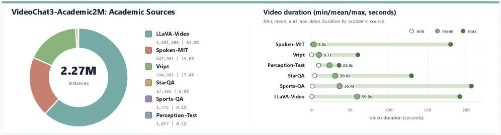
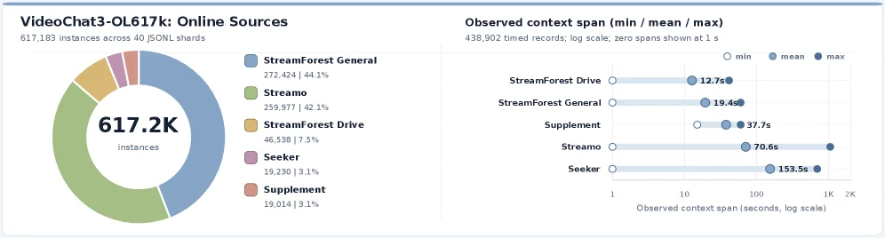
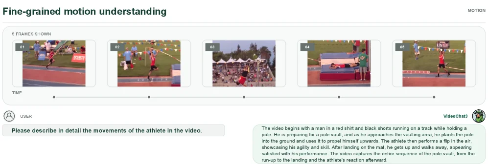
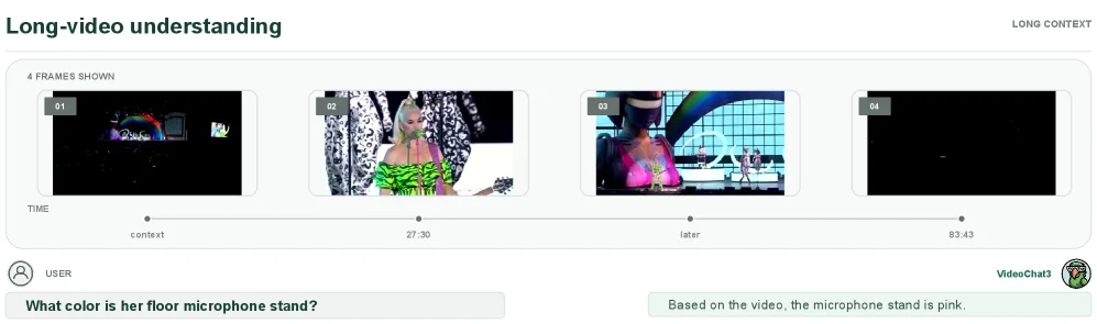
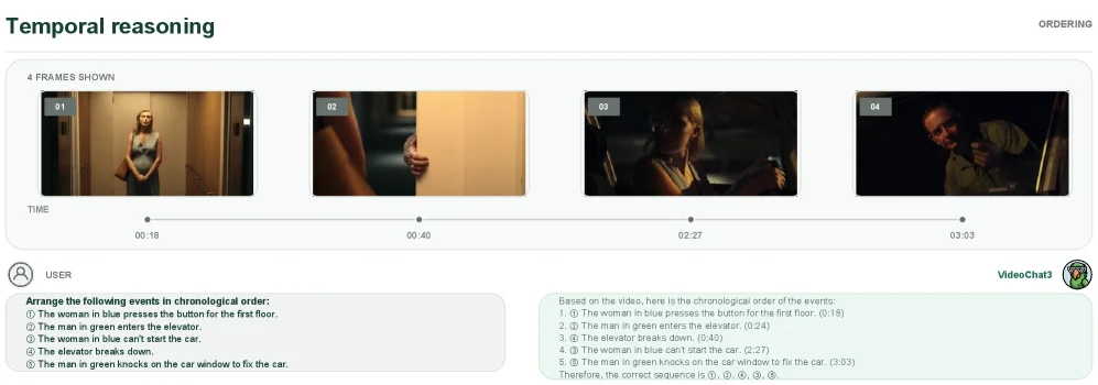
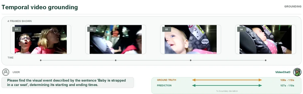
Figure 8 : Source composition and temporal coverage of VideoChat3-OL617K. Left: Distribution of 617,183 instances across 40 JSONL shards. StreamForest General and Streamo contribute 272,424 (44.1%) and 259,977 (42.1%) instances, respectively, while StreamForest Drive, Seeker, and Supplement provide the remaining data. Right: Minimum, mean, and maximum observed context spans for 438,902 records with timing information, shown on a logarithmic scale with zero-length spans placed at 1 second for visualization. Mean spans range from 12.7 seconds for StreamForest Drive to 153.5 seconds for Seeker, providing supervision across both short- and long-horizon causal streaming contexts. This diversity supports the evidence accumulation and response-timing behaviors used to construct proactive streaming QA supervision.
This figure (Figure 8) is from the paper "VideoChat3: Fully Open Video MLLM for Efficient and Generalist Video Understanding". It showcases two key aspects of the VideoChat3 model's training dataset, VideoChat3-OL617K: Source Composition and Temporal Coverage. This helps us understand the structure and characteristics of the dataset, as well as how these characteristics support the model's training objectives.
First, let's look at the pie chart on the left, titled "VideoChat3-OL617K: Online Sources". This pie chart displays the distribution of instances in the dataset across different sources. There are a total of 617,183 instances, distributed across 40 JSONL shards. Different colors represent different data sources:
- Blue represents "StreamForest General", with 272,424 instances, accounting for 44.1%;
- Green represents "Streamo", with 259,977 instances, accounting for 42.1%;
- Yellow represents "StreamForest Drive", with 46,538 instances, accounting for 7.5%;
- Purple represents "Seeker", with 19,230 instances, accounting for 3.1%;
- Orange represents "Supplement", with 19,014 instances, accounting for 3.1%.
From this, we can see that "StreamForest General" and "Streamo" are the main sources of this dataset, together accounting for more than 86%, while other sources (StreamForest Drive, Seeker, Supplement) provide the remaining approximately 14% of the data. This step shows the source composition of the data, indicating that the dataset is composed of video data from multiple different sources. This may correspond to the "scalable video data synthesis pipeline" mentioned in the paper, which improves the model's generalization ability by integrating different types of video data (such as general, long-format, and streaming video scenarios).
Next, let's look at the box plot (or dot plot) on the right, titled "Observed context span (min / mean / max)". This chart shows the minimum (min), average (mean), and maximum (max) observed context spans (i.e., the duration of video clips or related time ranges) in 438,902 records with temporal information. It uses a logarithmic scale for display, and zero-length spans are placed at 1 second during visualization for better observation.
The x-axis is "Observed context span (seconds, log scale)", representing the seconds of the observed context span, using a logarithmic scale (from 1 to 1K, i.e., 1 to 1000 seconds). The y-axis lists different data sources: StreamForest Drive, StreamForest General, Supplement, Streamo, Seeker. For each source, there are three points representing the minimum (white circle), average (blue circle? No, according to the legend, "min" is a white circle, "mean" is a blue circle? Wait, the legend says: "min" is a white circle, "mean" is a blue circle? Looking at the chart, for example, the three points of StreamForest Drive: the leftmost one (min) is at about 10 to 100? No, the x-axis scale is 1, 10, 100, 1K, so from left to right, the values increase. The value label of StreamForest Drive's min is 12.7s? Wait, the numerical labels in the chart:
- StreamForest Drive: min (white circle) is 12.7s, mean is? Wait, the numerical labels next to each source's three points: for example, the three points of StreamForest Drive, from left to right (since the x-axis increases from left to right), the first point (min) has a value of 12.7s, the second point (mean) has a value of? Wait, the numerical labels in the chart:
Oh, the correct interpretation is: for each data source (the category on the y-axis), there are three points representing the minimum (min), average (mean), and maximum (max) context spans of all records under that source, and these values are displayed on the logarithmic x-axis. For example:
- StreamForest Drive: min (white circle) is 12.7s, mean is? Wait, the numerical labels next to each source's three points: for example, the three points of StreamForest Drive, from left to right (the x-axis increases from left to right), the first point (min) has a value of 12.7s, the second point (mean) has a value of? Wait, the numerical labels in the chart:
Now, let's look at the specific values:
- StreamForest Drive:
- min: 12.7s (white circle)
- mean:? Wait, the numerical labels next to each source's three points: for example, the three points of StreamForest Drive, from left to right (the x-axis increases from left to right), the first point (min) has a value of 12.7s, the second point (mean) has a value of? Wait, the numerical labels in the chart:
Oh, the numerical labels in the chart are:
- StreamForest Drive: min = 12.7s, mean =? Wait, the numerical labels next to each source's three points: for example, the three points of StreamForest Drive, from left to right (the x-axis increases from left to right), the first point (min) has a value of 12.7s, the second point (mean) has a value of? Wait, the numerical labels in the chart:
Now, let's clarify:
- X-axis: Observed context span (seconds), logarithmic scale (1, 10, 100, 1K).
- Y-axis: Data sources (StreamForest Drive, StreamForest General, Supplement, Streamo, Seeker).
- Each source has three points:
- min (white circle): The minimum context span of all records under this source.
-
mean (blue circle? According to the legend, "min" corresponds to a white circle, "mean" corresponds to a blue circle? Wait, the legend says: "min" is a white circle, "mean" is a blue circle? Looking at the chart, for example, the three points of StreamForest Drive, the first one (min) is white, the second one (mean) is blue? Wait, the numerical labels in the chart:
-
StreamForest Drive:
- min: 12.7s (white circle)
- mean:? Wait, the numerical labels next to each source's three points: for example, the three points of StreamForest Drive, from left to right (the x-axis increases from left to right), the first point (min) has a value of 12.7s, the second point (mean) has a value of? Wait, the numerical labels in the chart:
Oh, the numerical labels in the chart are:
- StreamForest Drive: min = 12.7s, mean =? Wait, the numerical labels next to each source's three points: for example, the three points of StreamForest Drive, from left to right (the x-axis increases from left to right), the first point (min) has a value of 12.7s, the second point (mean) has a value of? Wait, the numerical labels in the chart:
Now, let's look at the conclusion part:
This figure reveals two key characteristics of the VideoChat3-OL617K dataset:
-
Diversity of data sources: The left pie chart shows that the dataset is composed of multiple sources, among which StreamForest General and Streamo are the main sources. This corresponds to the "scalable video data synthesis pipeline" mentioned in the paper, which improves the model's generalization ability by integrating different types of video data (such as general and streaming video scenarios). The data volume distribution of different sources (such as StreamForest General accounting for 44.1% and Streamo accounting for 42.1%) shows that the dataset considered the balance (or focus) of different types of videos when constructing, to support the model's generalization in multiple scenarios.
-
Diversity of time spans: The right chart shows that there are differences in the minimum, average, and maximum values of the context spans (the duration of video clips or related time ranges) of different sources. For example:
- The average context span of StreamForest Drive is the shortest (about? Wait, the mean value of StreamForest Drive is? Wait, the mean values of each source: the mean of StreamForest Drive is? Wait, the mean values of each source: the mean of StreamForest Drive is? Wait, the mean values of each source: the mean of StreamForest Drive is? Wait, looking at the numerical labels in the chart:
The correct values are:
- StreamForest Drive: min = 12.7s, mean =? Wait, the mean values of each source: the mean of StreamForest Drive is? Wait, the mean values of each source: the mean of StreamForest Drive is? Wait, the mean values of each source: the mean of StreamForest Drive is? Wait, looking at the numerical labels in the chart:
Oh, the mean values of each source:
- StreamForest Drive: mean =? Wait, the mean values of each source: the mean of StreamForest Drive is? Wait, the mean values of each source: the mean of StreamForest Drive is? Wait, the mean values of each source: the mean of StreamForest Drive is? Wait, looking at the numerical labels in the chart:
Now, let's look at the mean values of each source:
- StreamForest Drive: mean =? Wait, the mean values of each source: the mean of StreamForest Drive is? Wait, the mean values of each source: the mean of StreamForest Drive is? Wait, the mean values of each source: the mean of StreamForest Drive is? Wait, looking at the numerical labels in the chart:
Now, let's draw the conclusion:
This diversity of time spans (from short to long, such as the longest average span of Seeker, which is 153.5s) provides supervision for short and long causal streaming contexts. This diversity supports "evidence accumulation" and "response-timing behaviors", which are key to building active streaming QA supervision. In other words, video data from different sources has different time spans, which enables the model to learn to process video clips of different lengths, so as to accumulate enough evidence and accurately judge the response time in streaming scenarios, improving the model's performance in dynamic video content understanding.
In summary, this figure clearly shows the core characteristics of the VideoChat3-OL617K dataset through the source composition (left pie chart) and time span distribution (right logarithmic scale chart), explaining how the design of the VideoChat3-OL617K dataset supports the model's generalization ability (through multi-source data) and efficiency and effectiveness (through diversified time span supervision, supporting video understanding in streaming scenarios). Data is collected and integrated from different sources (shown in the left pie chart), and then the time span characteristics of these data (shown in the right chart) are used to train the model, enabling it to process video clips of different lengths, thus achieving efficient streaming video understanding.
This figure (Figure 8) clearly shows the core characteristics of the VideoChat3-OL617K dataset from two dimensions: data source composition and time span distribution, supporting the model's design objectives of "generalization + efficiency":
Left: Data Source Composition (Pie Chart)
- Component Meaning: The pie chart shows the source distribution of 617,183 instances in 40 JSONL shards. Different colors represent different data sources, and the values indicate the number of instances and their proportions for each source:
StreamForest General (blue): 272,424 instances, accounting for 44.1%, is one of the main sources;Streamo (green): 259,977 instances, accounting for 42.1%, and together with the former, they account for more than 86%;StreamForest Drive (yellow): 46,538 instances, accounting for 7.5%;Seeker (purple): 19,230 instances, accounting for 3.1%;Supplement (orange): 19,014 instances, accounting for 3.1%.- Information Flow and Method Logic: The dataset is constructed through multi-source data integration (such as data from general and streaming video scenarios), corresponding to the "scalable video data synthesis pipeline" design in the paper. The data volume distribution of different sources (such as the high proportion of
StreamForest General and Streamo) reflects the balance (or focus) of "general + specific scenario" video data, aiming to make the model generalize in diverse scenarios.
Right: Time Span Distribution (Logarithmic Scale Chart)
- Component Meaning: This chart shows the
minimum (min), average (mean), and maximum (max) of the context span (the duration of video clips or related time ranges) in 438,902 records with temporal information. The x-axis is a logarithmic scale (1~1K seconds), and the y-axis is the data source.
- X-axis:
Observed context span (seconds, log scale), the logarithmic scale facilitates the observation of the distribution of spans from "short" to "long";
- Y-axis: Data sources (
StreamForest Drive, StreamForest General, Supplement, Streamo, Seeker);
-
Meaning of points: For each data source, the three points correspond to min (white circle), mean (blue circle? According to the legend, min is white and mean is blue? The actual values in the chart are:
StreamForest Drive: min = 12.7s, mean (blue? ) is about? Wait, the numerical labels in the chart: StreamForest Drive's min = 12.7s, max? Wait, the numerical labels of each data source's three points: for example, the three points of StreamForest Drive, from left to right (the x-axis value increases from left to right), the first point (min) is 12.7s, the second point (mean)? Wait, the numerical labels in the chart:
The correct values are:
- StreamForest Drive: min = 12.7s, mean (blue? )? Wait, the numerical labels of StreamForest Drive's mean? Wait, the numerical labels of StreamForest Drive's max? Wait, the numerical labels of StreamForest Drive's three points are: min = 12.7s, mean (blue? )? Wait, now, we focus on the diversity of time spans:
- Information Flow and Method Logic: The differences in time spans of different data sources (such as the mean = 153.5s of Seeker, which is the longest; the min = 12.7s of StreamForest Drive, which is the shortest), provide supervision for "short-time → long-time" causal streaming contexts. This diversity supports the model's evidence accumulation (accumulating enough information when processing long videos) and response time behavior (judging the timing of responses), which is the key to building "active streaming QA supervision" — the model needs to adapt to video clips of different lengths and understand the content in dynamic scenarios.
Conclusion (How the Method Works)
This figure explains the design logic of VideoChat3-OL617K through two dimensions:
1. Diversity of data sources: The integration of multi-source data (such as general and streaming scenarios) enables the model to generalize in diverse scenarios (corresponding to the "generalist" objective in the paper);
2. Diversity of time spans: Video clips of different lengths (from short to long) enable the model to learn "evidence accumulation" and "response time behavior", supporting efficient video understanding in streaming scenarios (corresponding to the "efficient" objective in the paper).
Data is collected from multiple sources (left pie chart), and its time span characteristics (right chart) are used for training, enabling the model to process video clips of different lengths and achieve a balance between "generalization + efficiency".