🌊 Tide

Information moves like the tide. We pick the waves worth studying.

中文

← Today's tide

Published 2026-07-11 · ServiceNow-AI · Abhigya Verma, Khyati Mahajan, Amit Kumar Saha et al.

SynthDocBench: Controlled Benchmark for Long-Context Visual Document Understanding

arXiv · HuggingFace · ▲69

Abstract (verbatim)

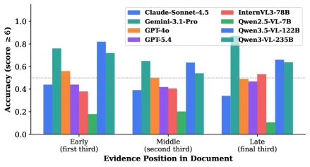
Vision language models (VLMs) have achieved strong performance on visual document understanding benchmarks such as DocVQA, ChartQA, and MMLongBench-Doc. However, real-world documents combine multiple factors such as length, layout complexity, modality, and question difficulty, which makes it difficult to attribute model failures to specific causes. We introduce SynthDocBench, a fully synthetic benchmark for long-context visual document understanding that systematically controls factors including document length, layout structure, modality composition, and question type. The benchmark is constructed using a combinatorial design, each factor is varied independently across generated documents, enabling controlled analysis of model behavior. Documents are generated end to end using an LLM pipeline across six layout archetypes, with a 40 percent random override to prevent models from exploiting spurious correlations. Additionally, SynthDocBench spans long-context documents with substantially greater length and structural diversity than existing benchmarks. Evaluating seven frontier VLMs, we uncover three failure modes that existing benchmarks cannot surface: sharp degradation with document length, a systematic positional sensitivity in which the middle third of a document is hardest for five of six models and five of six models show a negative Early-to-Late trend (steepest decline: 8.3 percentage points), and breakdown of chart comprehension in long-document settings. These results suggest that current models may be overfitting to benchmark artifacts rather than achieving robust long-context visual document understanding.

Background

Background Analysis

Technical Context: Vision-language models (VLMs) are critical for understanding long, visually rich documents (e.g., reports, manuals) in real-world applications like corporate document analysis or medical record processing. These tasks demand both long-range information retrieval and cross-modal reasoning (e.g., integrating chart data with text evidence across hundreds of pages).

Previous Limitations: Existing benchmarks (e.g., DocVQA, ChartQA) have advanced VLMs but suffer from two key flaws: 1) Real-world documents mix factors like length, layout, and modality, making it hard to pinpoint failure causes (e.g., distinguishing whether errors stem from length or layout complexity); 2) Long-document benchmarks (e.g., MMLongBench-Doc) lack systematic variable control, preventing isolated analysis of specific factors. Additionally, ecological validity (e.g., multi-page cross-modal reasoning) and interpretability are often at odds in real documents.

Proposed Solution: SynthDocBench addresses these issues with a synthetic benchmark. It uses an LLM pipeline to generate controlled documents, independently varying length, layout, modality, and question types, while introducing random overrides to prevent reliance on spurious correlations. The benchmark includes three subsets: "cross_modal" (testing cross-page evidence integration), "complex" (combining text-chart evidence), and others, covering 24 chart types and 6 layout archetypes. Automated generation ensures deterministic answers while enabling fine-grained analysis.

Key Difference: Unlike prior work, SynthDocBench prioritizes interpretability over ecological realism by using synthetic control. It reveals three previously hidden model failures: performance degradation with complexity, positional sensitivity (middle sections are hardest), and chart-comprehension collapse in long documents. This decomposition is unique to SynthDocBench and provides clear directions for improvement.

Method, Figure by Figure

M E T H O D1 / 15

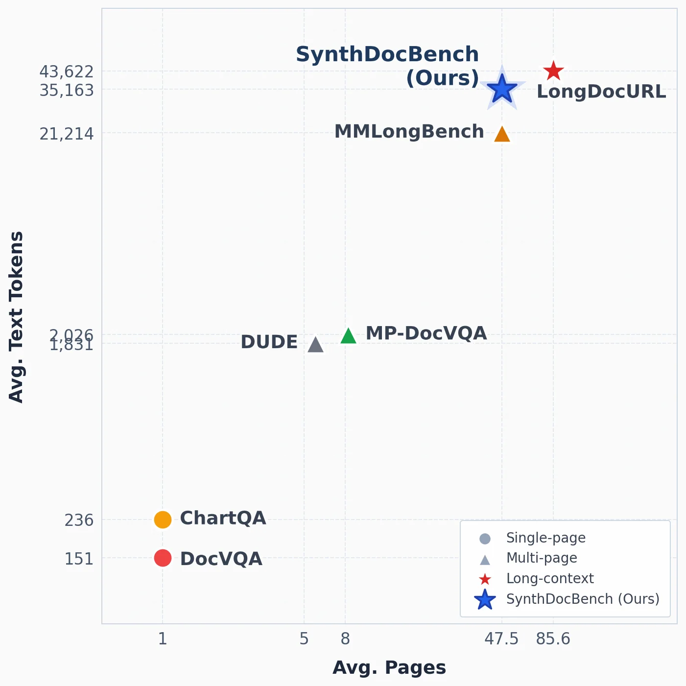
Figure 1: Landscape of benchmarks Top: benchmark comparison by average document length (pages) and average textual context (tokens). SynthDocBench occupies a unique region with both long multi-page context and high textual density. Bottom: comparison with existing chart and document VQA benchmarks. Prior benchmarks typically isolate either charts or long documents, whereas SynthDocBench is designed to study their intersection under long contexts.

This figure (Figure 1) illustrates the "landscape" of different benchmark tests in the field of visual document understanding, primarily divided into two sections, but we will focus on the upper chart for now. It compares multiple benchmarks across two key dimensions: average document length (in pages) and average text context (in tokens).

First, let's break down the components of this chart:

  1. Axes:

    • X-axis (Horizontal): Labeled "Avg. Pages" (Average Pages). It represents the average number of pages in each benchmark's documents. The values increase from left to right, ranging approximately from 1 page to 85.6 pages. This represents the document length.
    • Y-axis (Vertical): Labeled "Avg. Text Tokens" (Average Text Tokens). It represents the average number of text tokens in each benchmark's documents. The values increase from bottom to top, ranging approximately from 151 tokens to 43,622 tokens. This represents the textual complexity or information density of the documents.
  2. Data Points and Labels:

    • There are multiple colored markers on the graph, each representing a specific benchmark, accompanied by labels.
    • ChartQA (Orange dot): Located at approximately 1 page on the X-axis and 236 tokens on the Y-axis. This indicates it is a single-page document with a relatively small amount of text.
    • DocVQA (Red dot): Located at approximately 1 page on the X-axis and 151 tokens on the Y-axis. Similar to ChartQA, it is also a single-page document but with slightly less text than ChartQA.
    • DUDE (Gray triangle): Located at approximately 5 pages on the X-axis and 1,831 tokens on the Y-axis. This is a multi-page document with a moderate amount of text.
    • MP-DocVQA (Green triangle): Located at approximately 8 pages on the X-axis and 2,026 tokens on the Y-axis. This is also a multi-page document with a text volume similar to or slightly higher than DUDE.
    • MMLongBench (Orange triangle): Located at approximately 47.5 pages on the X-axis and 21,214 tokens on the Y-axis. This is a multi-page document with a significantly increased text volume.
    • SynthDocBench (Ours) (Blue star): Located near 47.5 pages on the X-axis and 35,163 tokens on the Y-axis. This is a multi-page document with a very high text volume.
    • LongDocURL (Red star): Located at approximately 85.6 pages on the X-axis and 43,622 tokens on the Y-axis. This is the benchmark with the most pages and the largest text volume among all tests.
  3. Legend:

    • The legend explains the types of benchmarks represented by different shapes and colors:
      • Gray dot: Single-page
      • Gray triangle: Multi-page
      • Red star: Long-context
      • Blue star: SynthDocBench (Ours)
  4. Flow of Data or Information:

    • The chart visually displays the distribution of benchmarks in terms of document length and textual complexity by mapping each benchmark to the two dimensions of "average pages" and "average text tokens."
    • Readers can compare the difficulty or characteristics of different benchmarks by observing the position of the data points. For example, data points in the upper-right corner (like SynthDocBench and LongDocURL) represent longer documents with more complex text, while those in the lower-left corner (like ChartQA and DocVQA) represent shorter documents with simpler text.
  5. Revealing the Method's Operation:

    • This chart reveals the design goals and features of SynthDocBench. Based on its position in the chart, SynthDocBench occupies a unique area: it has a very long multi-page context (comparable to LongDocURL in terms of page count) and a very high text density (a very high number of tokens, even exceeding LongDocURL).
    • The paper mentions that existing benchmarks typically study charts or long documents in isolation. SynthDocBench aims to study their intersection in long contexts. The chart confirms this by showing SynthDocBench's position in both the "long pages" and "high text tokens" dimensions, demonstrating its capability to handle longer and more complex documents than existing benchmarks.
    • Specifically, SynthDocBench's "average pages" is approximately 47.5, comparable to MMLongBench, but its "average text tokens" is approximately 35,163, which is much higher than MMLongBench's approximately 21,214. This indicates that SynthDocBench is not only challenging in terms of document length but also in terms of text information density.
    • Additionally, SynthDocBench is labeled as a "Long-context" type in the chart, further emphasizing its focus on long-context understanding.
  6. Comparison Objects and Conclusion:

    • Comparison Objects: This chart compares SynthDocBench with several existing benchmarks (such as ChartQA, DocVQA, DUDE, MP-DocVQA, MMLongBench, LongDocURL).
    • Conclusion: From the chart, it is clear that SynthDocBench holds a unique position in both the "average pages" and "average text tokens" dimensions. It has a longer document length and higher textual complexity than most existing benchmarks (like ChartQA, DocVQA, DUDE, MP-DocVQA). Although LongDocURL exceeds SynthDocBench in document length, SynthDocBench still has an advantage or is comparable in terms of text token count. This suggests that SynthDocBench can provide a more challenging environment for evaluating the performance of vision-language models in handling long documents and dense text, which is difficult for existing benchmarks to achieve simultaneously. This aligns with the paper's abstract statement that "SynthDocBench spans long-context documents with substantially greater length and structural diversity than existing benchmarks."

In summary, this figure clearly visualizes the unique positioning of SynthDocBench in terms of document length and textual complexity, highlighting its advantage as a long-context visual document understanding benchmark—its ability to handle both long documents and high-density text simultaneously, a challenge that existing benchmarks struggle to meet concurrently.

Figure 1: Landscape of benchmarks Top: benchmark comparison by average document length (pages) and average textual context (tokens). SynthDocBench occupies a unique region with both long multi-page context and high textual density. Bottom: comparison with existing chart and document VQA benchmarks. Prior benchmarks typically isolate either charts or long documents, whereas SynthDocBench is designed to study their intersection under long contexts.

This figure (Figure 1) presents the "landscape" of benchmarks for visual document understanding, divided into two main sections to clearly compare existing benchmarks with the proposed SynthDocBench.

Top Section (not shown in the current image but described by the caption): This part is a scatter plot comparing different benchmarks based on their average document length (in pages) and average textual context (in tokens). SynthDocBench occupies a unique region in this plot, as it features both long multi-page context and high textual density. This means it can test model performance on very long and information-dense documents, a capability lacking in many existing benchmarks.

Bottom Section (shown in the current image): This is a conceptual diagram illustrating the limitations of existing chart and document VQA benchmarks and the design goals of SynthDocBench. 1. Left-side document icon: Represents a typical visual document containing text (e.g., paragraphs) and charts (e.g., pie charts and bar charts). This symbolizes complex real-world documents that combine multiple information modalities. 2. Right-side magnifying glass icon: Represents a Question Answering (QA) task performed on the document content. The magnifying glass focuses on a part of the document, indicating that the model needs to extract information from the document to answer questions. 3. Dashed path with numbers (1, 2, 3) and arrows connecting the document and magnifying glass: These elements depict the information processing flow or the aspects of benchmarking. * Path 1 (dashed line with downward arrow): Likely represents the initial information retrieval or question comprehension phase from the document. The number "1" marks this step. * Path 2 (dashed line with a dot): May represent a matching or association process between the question and the document content. The number "2" marks this intermediate state or point of focus. * Path 3 (solid arrow): Ultimately points to the magnifying glass, indicating that based on the previous steps, the model analyzes a specific region (like a chart) to generate an answer. The number "3" might represent the final answer generation or verification stage. 4. Overall layout: By separating and connecting the document and the questioning process, the diagram emphasizes that the core of benchmarking is to evaluate how well a model understands complex visual documents and answers related questions.

Methodology (combining caption and diagram): This figure reveals the design philosophy and methodology of SynthDocBench: * Addressing gaps in existing benchmarks: Existing benchmarks (e.g., DocVQA focuses on documents, ChartQA on charts) typically study charts and long documents separately. SynthDocBench aims to study their intersection in long-context settings. * Systematic variable control: Although not directly shown in the image, the caption mentions that SynthDocBench systematically controls factors like document length, layout structure, modality composition (e.g., charts and text), and question types through combinatorial design. This allows researchers to analyze model behavior under different conditions and identify specific causes of failure. * Synthetic data generation: Documents are generated end-to-end using an LLM (Large Language Model) pipeline, incorporating six layout archetypes, with a 40% random override to prevent models from exploiting spurious correlations. * Evaluating long-document challenges: The benchmark tests model performance on documents that are substantially longer and more structurally diverse than those in existing benchmarks, uncovering three failure modes not surfaced by current benchmarks: sharp performance degradation with increasing document length, systematic positional sensitivity (the middle third of a document being hardest for most models), and breakdown of chart comprehension in long-document settings.

Conclusion (based on the caption): This figure clearly demonstrates that SynthDocBench fills a critical gap in current visual document understanding benchmarks. It not only tests a model's ability to handle long documents and charts but, more importantly, it tests the combination of these abilities in a controlled environment, allowing for the analysis of model behavior. This is crucial for understanding and improving the performance of vision-language models on complex real-world documents.

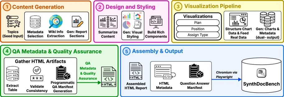
Figure 2: Synthetic visual document generation pipeline. From a topic seed, the pipeline generates grounded report content, applies document-level visual styling, synthesizes visualizations, performs metadata and QA validation, and assembles the final HTML/PDF reports with a machine-readable QA manifest.

This figure illustrates the synthetic visual document generation pipeline for SynthDocBench, detailing the entire process from topic seed to final report generation:

  1. Content Generation:
  2. The process starts with "Topics (Seed Input)" as the starting point for generation.
  3. Next is "Metadata Selection", where metadata is chosen.
  4. Then "Wiki Info Extraction" extracts information from Wikipedia.
  5. Finally, "Gen: Report Sections" generates sections of the report.

  6. Design and Styling:

  7. "Summarize Content" summarizes the generated content.
  8. "Gen: Visual Styling" generates the visual styling.
  9. "Build Rich Components" constructs rich components.

  10. Visualization Pipeline:

  11. "Visualizations Plan" plans the visualizations.
  12. "Position" and "Assign Type" determine the position and assign types, respectively.
  13. "Structure Chart Data & Feed Real Data" structures chart data and inputs real data.
  14. "Gen: Charts & Metadata (dual-output)" generates charts and metadata (dual-output).

  15. QA Metadata & Quality Assurance:

  16. "Gather HTML Artifacts" collects HTML artifacts.
  17. "Extract Table" extracts tables.
  18. "Validate Consistency" validates consistency.
  19. "Programmatic QA Manifest Generation" programmatically generates a QA manifest.
  20. "QA Metadata & Quality Assurance" performs quality assurance.

  21. Assembly & Output:

  22. "Assembled HTML Report" assembles the HTML report.
  23. "HTML Metadata" processes HTML metadata.
  24. "Question Answer Manifest" generates a question-answer manifest.
  25. Finally, the report is output to "SynthDocBench" via "Chromium via Playwright".

The entire process starts from a topic seed, goes through content generation, design and styling, visualization pipeline, QA metadata and quality assurance, and finally assembles and outputs the report. Each step has clear tasks and outputs, ensuring that the generated documents have controllable factors such as document length, layout structure, modality composition, and question type, allowing for systematic analysis.

Figure 3: QA generation pipeline. The pipeline parses the generated report into structured evidence channels, extracts and synthesizes key information, and generates chart-reading, cross-modal, and multi-hop questions. A verification stage filters weak or malformed items before serializing the final QA output.

This diagram (Figure 3) illustrates the workflow of the QA Generation Pipeline used to construct the SynthDocBench benchmark for question-answer pairs. We break it down by modules and data flow:

1. Module a: Deterministic Key Information Extraction

  • Input: "Synthetic Reports" containing multiple visualization formats (HTML+D3.js charts, charts, timelines, infographics), ultimately output as PDFs.
  • Function: Parses these diverse document contents (text, charts, timelines, etc.) into structured evidence channels (e.g., text paragraphs, chart data, timeline events) to prepare for subsequent information extraction.

2. Module b: Query Generation

  • Step 1: Generate three types of queries based on the extracted key information:
  • Chart Queries: Questions about chart content (e.g., data interpretation, trend analysis).
  • Cross Modal Queries: Questions combining multimodal information (e.g., "How is data X in the chart described in the text?").
  • Multi-Hop Queries: Questions requiring multi-step reasoning (e.g., "First find information in Section A, then combine with the chart in Section B to answer Question C").
  • Step 2: These queries and their corresponding answers (QA Pairs) are fed into the Verification Stage:
  • Adversarial Verification: Checks for logical errors, formatting issues, or susceptibility to spurious correlations (randomly masks 40% of content to prevent overfitting).
  • Autocorrection: Fixes issues identified during verification and filters out "weak" or "malformed" QA pairs (e.g., nonsensical questions, incorrect answers).

3. Output and Storage

  • After verification and correction, a Structured QA Output is generated with three key attributes:
  • Difficulty: Labels the question’s difficulty (e.g., easy, medium, hard).
  • Verification Status: Records whether verification passed.
  • GT Answer: The ground-truth answer (for evaluating models later).
  • Finally, these structured QA pairs are stored in the SynthDocBench database for model training or evaluation.

Data Flow Summary:

Synthetic Reports (multimodal content) → Key Information Extraction (parsed into structured channels) → Three types of queries + answers → Adversarial Verification + Autocorrection → Structured QA Output (with difficulty, verification status, GT answer) → Stored in SynthDocBench.

The diagram’s core focus is demonstrating how to systematically and controllably generate QA pairs for long-context visual document understanding: By parsing diverse synthetic reports, generating multiple query types, and enforcing strict verification/correction, the process ensures high-quality, target-factor-covered (e.g., length, layout, modality, difficulty) QA pairs. This ultimately builds a long-context benchmark that exposes model weaknesses.

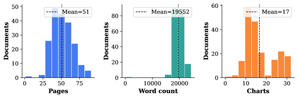
Figure 4: Document composition statistics across 200 reports.

This figure (Figure 4) presents the document composition statistics for 200 reports used to construct the SynthDocBench benchmark. It reveals key features of these synthetic documents through three separate histograms, each illustrating a different dimension, which is crucial for understanding model behavior.

First, examining the leftmost histogram, its x-axis represents "Pages," and the y-axis represents "Documents." This chart shows the distribution of document page counts among the 200 reports. We can observe that most documents cluster around 50 pages, with a mean value (Mean=51) also close to this number. This indicates that the document lengths in SynthDocBench are controllable and can be systematically varied, as mentioned in the paper's abstract, which states that the benchmark covers documents with substantially greater length and structural diversity than existing benchmarks.

The middle histogram has "Word count" on its x-axis and "Documents" on its y-axis. This chart displays the distribution of word counts within the documents. Similar to the page count distribution, most documents concentrate around approximately 20,000 words, with a mean value of 19,552. This further demonstrates the controllability of document length and suggests that these documents may contain a significant amount of textual information, which is important for testing the ability of vision-language models to process long text.

The rightmost histogram has "Charts" on its x-axis and "Documents" on its y-axis. This chart illustrates the distribution of the number of charts contained within the documents. The mean value is 17 charts, indicating that these documents typically include a certain number of charts. This aligns with the "modality composition" factor mentioned in the paper, meaning models need to process both text and chart information simultaneously.

Through these three histograms, we can understand how SynthDocBench operates: it generates documents with varying lengths (in pages and words) and different numbers of charts, systematically controlling these key factors. This combinatorial design allows researchers to independently vary each factor for controlled analysis to understand model behavior under different conditions. For instance, by observing the page count distribution, we can study model performance degradation when handling increasingly long documents; by observing the chart count distribution, we can evaluate model chart comprehension in documents containing multiple charts.

In summary, this figure clearly shows three core statistical features of the 200 reports in SynthDocBench: page count, word count, and chart count. The distribution of these features reveals the design principles of the benchmark, which is to create an environment for comprehensively testing vision-language models by systematically controlling factors like document length and modality composition.

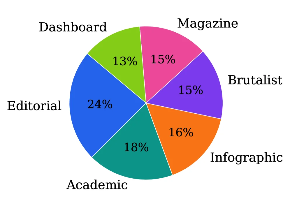
Figure 4: Document composition statistics across 200 reports.

This figure (Figure 4) presents the document composition statistics for 200 reports used in the SynthDocBench benchmark for evaluating visual document understanding models. It uses a pie chart to clearly illustrate the distribution of different types of document layouts or categories.

First, let's understand the various components in the figure: - Pie Chart: This is the core part of the figure, where the entire circle represents all 200 reports. - Different Colored Sector Regions: Each sector region represents a specific type of document layout or category. There are a total of six different categories in the figure, each distinguished by a different color and labeled with the corresponding percentage. - Category Labels: Each sector region is accompanied by a corresponding label indicating the name of the category. These categories include: - Dashboard: Represented by green, accounting for 13%. - Magazine: Represented by pink, accounting for 15%. - Brutalist: Represented by purple, accounting for 15%. - Infographic: Represented by orange, accounting for 16%. - Academic: Represented by teal, accounting for 18%. - Editorial: Represented by blue, accounting for 24%. - Percentage Values: Each sector region is labeled with the percentage of that category in the total number, and these values directly reflect the distribution proportion of each type of document among the 200 reports.

This figure reveals the diversity of document generation in the SynthDocBench method. According to the paper's abstract, this method uses an LLM (Large Language Model) pipeline to generate documents end - to - end and spans six layout archetypes (i.e., the six categories shown in the figure). Through this combinatorial design, each factor (such as document length, layout structure, modality composition, and question type) varies independently across different generated documents, thus enabling a controlled analysis of model behavior. The proportion of the 200 reports shown in the figure illustrates that in SynthDocBench, different types of document layouts are systematically created and controlled to ensure that models are evaluated in various scenarios.

Specifically, this figure helps us understand how SynthDocBench is constructed: - It shows six different document layout archetypes, each occupying a different proportion among the 200 reports. - For example, the "Editorial" category has the highest proportion at 24%, while the "Dashboard" category has the lowest proportion at 13%. This distribution ensures that models will encounter various types of document layouts during evaluation, thus more comprehensively testing their performance.

In summary, this figure, by presenting the document composition statistics of 200 reports, reveals the diversity and systematicness of document generation in the SynthDocBench method. It helps us understand how this method creates a comprehensive benchmark to evaluate the performance of visual document understanding models by controlling different factors.

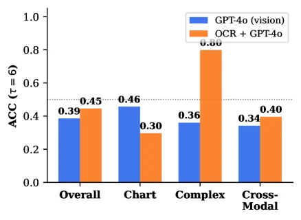
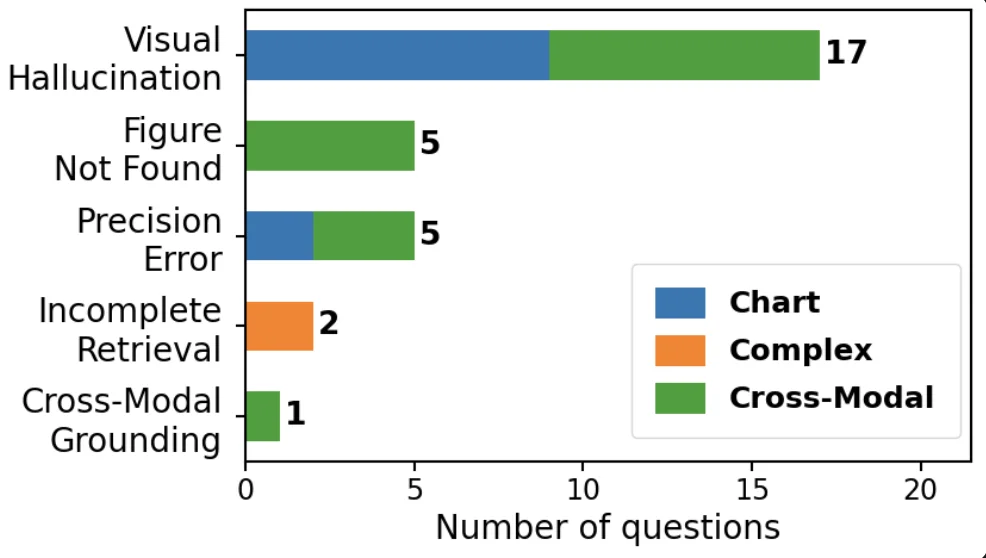
Figure 5: GPT-4o vision vs. OCR+GPT-4o (text-only) ACC by subset. Vision dominates on Chart; OCR dominates on Complex. Figure 6: Hard failures: 109 questions where all six models score ≤ 3 \leq 3 , broken down by error category and question subset ( Ch. = chart-reading; Cx. = complex; XM. = cross-modal).

This figure (Figure 5) shows the accuracy (ACC) of two different configurations of the GPT-4o model on different question subsets in the SynthDocBench benchmark. The x-axis represents four different question subsets: Overall, Chart (chart reading), Complex (complex questions), and Cross-Modal. The y-axis represents the accuracy (ACC), which is calculated based on a metric with τ=6 (the specific meaning of τ is not detailed in the caption, but it is usually related to consistency in ranking tasks).

There are two types of bar charts in the figure: - The blue bars represent the "GPT-4o (vision)" model, which is the GPT-4o model using only visual input. - The orange bars represent the "OCR + GPT-4o" model, which first extracts text from the document using optical character recognition (OCR) and then inputs the text into the GPT-4o model.

From the figure, we can observe: 1. On the "Overall" subset, the accuracy of GPT-4o (vision) is 0.39, while that of OCR + GPT-4o is 0.45, and OCR + GPT-4o performs better. 2. On the "Chart" subset, the accuracy of GPT-4o (vision) is 0.46, while that of OCR + GPT-4o is 0.30, and GPT-4o (vision) performs better, which verifies the statement in the caption that "Vision dominates on Chart" (vision is dominant in chart reading). 3. On the "Complex" subset, the accuracy of GPT-4o (vision) is 0.36, while that of OCR + GPT-4o is 0.80, and OCR + GPT-4o performs much better than GPT-4o (vision), which verifies the statement in the caption that "OCR dominates on Complex" (OCR is dominant in complex questions). 4. On the "Cross-Modal" subset, the accuracy of GPT-4o (vision) is 0.34, while that of OCR + GPT-4o is 0.40, and OCR + GPT-4o performs slightly better.

The purpose of this figure is to compare the performance of GPT-4o with visual input and GPT-4o with text input (via OCR) on different types of questions, thus revealing the advantages and disadvantages of the model in different scenarios. For example, in chart reading tasks, the model with visual input performs better, while in complex text questions, the model with text input performs better. This helps us understand the behavior of the model under different modalities and question types, providing a basis for further improving the model.

Figure 5: GPT-4o vision vs. OCR+GPT-4o (text-only) ACC by subset. Vision dominates on Chart; OCR dominates on Complex. Figure 6: Hard failures: 109 questions where all six models score ≤ 3 \leq 3 , broken down by error category and question subset ( Ch. = chart-reading; Cx. = complex; XM. = cross-modal).

This figure (combined with its original caption "Figure 6: Hard failures: 109 questions where all six models score ≤ 3, broken down by error category and question subset (Ch. = chart-reading; Cx. = complex; XM. = cross-modal)") displays the distribution of "hard failure" questions (a total of 109) that scored ≤ 3 on all six evaluated Visual Language Models (VLMs). These errors are categorized into different "error categories" and further subdivided by "question subsets."

First, let's look at the axes of the graph: * X-axis (Horizontal axis): Represents the "Number of questions," ranging from 0 to 20. This indicates the total number of questions belonging to each specific error category and subset combination. * Y-axis (Vertical axis): Lists different "error categories" from top to bottom as follows: * "Visual Hallucination" * "Figure Not Found" * "Precision Error" * "Incomplete Retrieval" * "Cross-Modal Grounding"

Next, we analyze the data representation in the graph: * Each error category is represented by a horizontal bar graph, where the length of the bar corresponds to the total number of questions in that category. * The bar graphs are divided into blocks of different colors, representing different question subsets: * Blue (Chart): Represents the question subset related to chart reading (corresponding to "Ch." in the caption). * Orange (Complex): Represents the question subset related to complex questions (corresponding to "Cx." in the caption). * Green (Cross-Modal): Represents the question subset related to cross-modal tasks (corresponding to "XM." in the caption). * At the end of each bar, the total number of questions in that category is labeled.

Now, let's analyze the distribution of each error category and its subsets one by one: 1. Visual Hallucination: * Total number of questions: 17. * This bar graph is entirely composed of green (Cross-Modal) blocks, indicating that all 17 hard error questions related to "visual hallucination" belong to the "cross-modal" subset. 2. Figure Not Found: * Total number of questions: 5. * This bar graph is also entirely composed of green (Cross-Modal) blocks, indicating that all 5 hard error questions related to "figure not found" belong to the "cross-modal" subset. 3. Precision Error: * Total number of questions: 5. * This bar graph is composed of two parts: one blue (Chart) and one green (Cross-Modal). Visually, the blue part appears to be about 2 units long, and the green part about 3 units long. This indicates that in the "precision error" category, 2 questions belong to the "chart-reading" subset, and 3 questions belong to the "cross-modal" subset. 4. Incomplete Retrieval: * Total number of questions: 2. * This bar graph is entirely composed of orange (Complex) blocks, indicating that both hard error questions related to "incomplete retrieval" belong to the "complex" subset. 5. Cross-Modal Grounding: * Total number of questions: 1. * This bar graph is entirely composed of green (Cross-Modal) blocks, indicating that this hard error question related to "cross-modal grounding" belongs to the "cross-modal" subset.

Understanding the information revealed by this figure and how it works: This figure helps us understand in which areas models tend to make severe errors by classifying "hard errors" (questions where all six models scored ≤ 3) according to "error types" and "question subsets." * How it works: First, researchers identified all questions where all six models performed poorly (scored ≤ 3), totaling 109 questions. Then, they categorized these errors into different error categories (such as visual hallucination, figure not found, etc.). Next, they further analyzed which type of question subset (chart-reading, complex questions, or cross-modal questions) these problems belonged to. In this way, the distribution of different types of errors across different question subsets can be clearly seen. * Conclusions: * The "visual hallucination" and "figure not found" error categories mainly occur in the "cross-modal" subset. * "Precision error" involves both the "chart-reading" and "cross-modal" subsets but is more biased towards "cross-modal." * Errors in "incomplete retrieval" mainly occur in the "complex" subset. * Errors in "cross-modal grounding" are fewer but also belong to the "cross-modal" subset. This analysis helps researchers understand the weaknesses of the models. For example, models may be more prone to errors in certain specific types of tasks (such as visual hallucination, figure not found) when processing cross-modal information, while they may encounter difficulties in precision or retrieval when dealing with complex questions.

In summary, this figure, through clear classification and visualization, shows in which specific error types and question subsets models perform the worst in long-document visual understanding tasks, providing a targeted direction for subsequent model improvements.

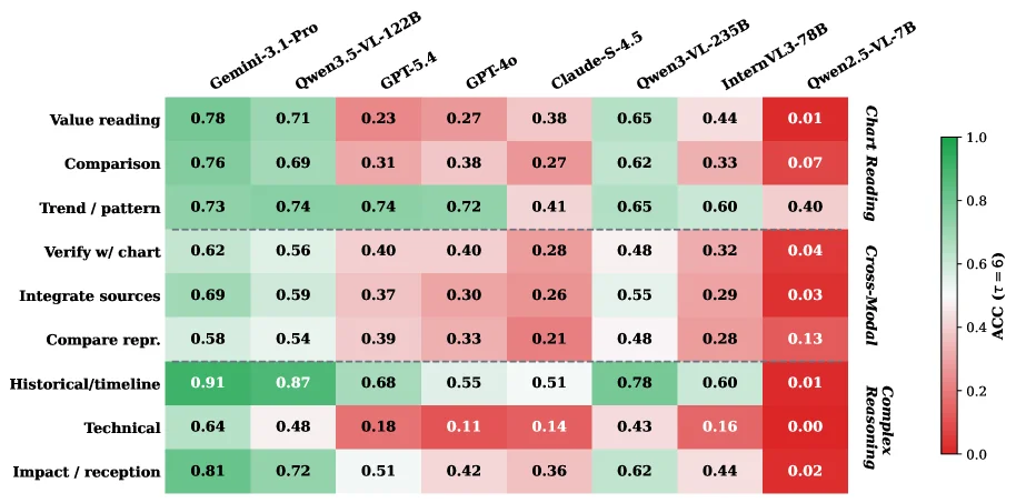
Figure 7: ACC ( τ = 6 \tau{=}6 ) by fine-grained question category. Rows are grouped by subset (Chart Reading, Cross-Modal, Complex Reasoning); columns are models ordered by overall ACC. The colour scale runs from red (0) to green (1). Full numerical values are in Table 12 (Appendix I ).

This figure (Figure 7) displays the accuracy (ACC) of different Vision Language Models (VLMs) across fine-grained question categories, where τ=6. Let's break down the components and information presented:

First, the rows in the figure represent the fine-grained question categories, which are grouped into three main subsets (from top to bottom): 1. Chart Reading: This subset includes sub-categories like "Value reading," "Comparison," "Trend / pattern," and "Verify w/ chart." These questions primarily test a model's ability to extract and understand information from charts. 2. Cross-Modal: This subset includes sub-categories like "Integrate sources" and "Compare repr." These questions require the model to process and combine both textual and visual information. 3. Complex Reasoning: This subset includes sub-categories like "Historical/timeline," "Technical," and "Impact / reception." These questions often require multi-step reasoning or understanding complex information.

Each row (question category) contains specific sub-types of questions, such as "Value reading" or "Historical/timeline."

The columns in the figure represent different VLMs, ordered from left to right based on their overall accuracy (highest to lowest). The models listed are: * Gemini-3.1-Pro * Qwen3.5-VL-122B * GPT-5.4 * GPT-4o * Claude-S-4.5 * Qwen3-VL-235B * InternVL3-78B * Qwen2.5-VL-7B

Each cell (intersection of a row and a column) is color-coded to represent the accuracy (ACC) of that model on the corresponding question category. The color scale is shown on the right side of the figure, ranging from red (representing ACC=0, poor performance) to green (representing ACC=1, excellent performance). The greener the cell, the better the model's performance on that category; the redder the cell, the poorer the performance.

Flow of data/information: Readers can first identify an interesting task type by finding the corresponding row (question category) and then compare the performance of different models (columns) on that task (by assessing the color intensity). Alternatively, one can select a model (column) and observe its strengths and weaknesses across different question categories by examining the color variations within that column.

Methodology revealed by this figure (i.e., how SynthDocBench works): While this figure is a result visualization, it indirectly reflects the design principles of the SynthDocBench benchmark: 1. Fine-grained analysis: By breaking down questions into specific categories (e.g., Chart Reading, Cross-Modal, Complex Reasoning, and their sub-categories), a more detailed analysis of model performance is possible beyond a single overall accuracy score. 2. Controlled variables: According to the paper's abstract, SynthDocBench systematically controls factors like document length, layout structure, modality composition, and question type using a combinatorial design. This means the results in this figure can help identify specific tasks or problems where models are likely to fail. 3. Synthetic data: Documents are generated end-to-end using an LLM pipeline, with a 40% random override to prevent models from exploiting spurious correlations. This ensures the evaluation is challenging and realistic. 4. Long-context: The benchmark includes significantly longer and more structurally diverse documents than existing benchmarks, allowing it to uncover model-specific failure modes when dealing with long documents, such as the low accuracy of certain models on specific question categories shown in the figure.

Coordinates, comparison objects, and conclusions: * Coordinates: The X-axis represents the models, and the Y-axis represents the question categories. Color is the third dimension, representing the ACC value. * Comparison objects: * Between different models: For example, Qwen3.5-VL-122B shows good performance (deeper green) in several sub-categories under "Chart Reading," while Qwen2.5-VL-7B performs poorly (deeper red) in many categories. * Within the same model: For instance, Gemini-3.1-Pro performs well in the "Chart Reading" category but less well (more red) in the "Technical" sub-category under "Complex Reasoning." * Conclusions (directly observable from the figure): * There are significant performance differences across models and question categories. Some models excel in certain categories but struggle in others. * For example, in the "Historical/timeline" sub-category (under Complex Reasoning), Qwen3.5-VL-122B and Gemini-3.1-Pro achieve very high accuracy (close to 1, deep green), while Qwen2.5-VL-7B has very low accuracy (close to 0, deep red). * "Technical" questions (also under Complex Reasoning) seem to be a challenge for most models, as many show lower accuracy (more red) in this area. * This figure clearly illustrates the strengths and weaknesses of various models across different types of visual document understanding tasks, identified through the controlled factors in the SynthDocBench benchmark. This helps researchers understand model limitations and guides future improvements.

In summary, this figure uses a color-coded matrix to intuitively compare the performance of seven state-of-the-art VLMs on different fine-grained question categories within the SynthDocBench benchmark, revealing significant performance differences across models and task types, achieved by controlling factors like document length, layout, modality, and question difficulty.

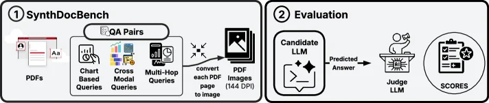
Figure 8: Evaluation pipeline. Rendered PDFs are converted to page images at 144 DPI, grouped into concatenated 5-page strips, and supplied directly to candidate models at temperature 0. Candidate answers are then scored against deterministic reference answers by GPT-5 acting as the judge model 𝒥 \mathcal{J} .

This diagram illustrates the Evaluation Pipeline of the SynthDocBench benchmark, which is divided into two core modules: SynthDocBench (Synthetic Document Benchmark Construction) and Evaluation (Assessment Phase). The flow of data/information is as follows:

Module 1: SynthDocBench (Construction of Synthetic Document Benchmark)

  • Input: The "PDFs" on the left represent original long documents (which could be real or synthetic PDFs containing long text and visual content).
  • Processing Step 1: Generate QA Pairs: Through the "QA Pairs" module, three types of questions are generated based on the PDF:
  • Chart Based Queries (questions based on charts, as indicated by the chart icon);
  • Cross Modal Queries (cross-modal questions involving mixed modalities like charts and tables, as indicated by the corresponding icon);
  • Multi-Hop Queries (multi-step reasoning questions, as indicated by the complex query icon with a phone and clock).
    This step defines the types and difficulty levels of questions for subsequent document understanding tasks.
  • Processing Step 2: Convert PDF to Image: Each PDF page is converted into an image at 144 DPI (as shown by the "convert each PDF page to image" icon and "PDF Images (144 DPI)"). This step simulates the process of image-based document understanding in real-world scenarios.

Module 2: Evaluation (Assessment Phase)

  • Input: The processed "PDF Images (144 DPI)" (i.e., document page images at 144 DPI).
  • Processing Step 1: Candidate LLM Inference: The image is fed into the "Candidate LLM" (a candidate language model, such as a vision-language model), which generates a "Predicted Answer" under the setting of temperature=0 (ensuring deterministic output).
  • Processing Step 2: Judge LLM Scoring: The "Predicted Answer" is passed to the "Judge LLM" (a judge model, such as GPT-5), which compares it with the deterministic reference answer (provided by the QA pair generation process of SynthDocBench) and outputs "SCORES" to evaluate the performance of the candidate model.

Complete Logic of the Method (From Document to Score)

  1. Document Preparation: Use long documents (in PDF format) as input, covering combinations of factors such as length, layout complexity, modality, and question difficulty in real-world scenarios.
  2. Question Generation: Generate three types of questions (chart-based, cross-modal, and multi-hop) based on the document content to ensure diversity in question types.
  3. Image Conversion: Convert each PDF page into an image at 144 DPI to simulate the "image input" phase of visual document understanding.
  4. Model Inference: The candidate LLM (vision-language model) generates a predicted answer based on the image under the temperature=0 setting (ensuring reproducible and deterministic output).
  5. Scoring Verification: The judge LLM (such as GPT-5) compares the predicted answer with the reference answer and outputs a score to quantify the model's performance.

Key Details

  • 144 DPI Conversion: Ensures sufficient image clarity to support accurate recognition of visual content (such as charts and text) by the model.
  • Temperature=0: Makes the output of the candidate LLM more deterministic and avoids interference from randomness in the evaluation results.
  • Judge Model (GPT-5): Acts as the evaluator of the "deterministic reference answer," ensuring objectivity and consistency in scoring.

This diagram clearly shows how SynthDocBench achieves controllable evaluation of long-context visual document understanding models through the process of "synthetic documents + controllable questions + image conversion + LLM inference + judge scoring" (i.e., systematically controlling factors such as document length, layout, and modality to analyze the model's behavior patterns).

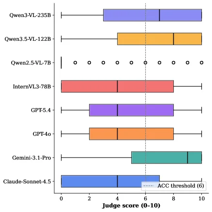
Figure 9: Distribution of judge scores (0–10) per model.

This figure (Figure 9) illustrates the distribution of judge scores (ranging from 0 to 10) for different vision-language models (VLMs). Here's a detailed breakdown:

  1. Chart Components and Elements:

    • Y-axis: Lists the seven frontier VLMs being evaluated. From top to bottom, they are: Qwen3-VL-235B, Qwen3.5-VL-122B, Qwen2.5-VL-7B, InternVL3-78B, GPT-5.4, GPT-4o, Gemini-3.1-Pro, and Claude-Sonnet-4.5.
    • X-axis: Represents the "Judge score," with a scale from 0 to 10.
    • Boxplot/Violinplot Elements: Each model is represented by a horizontal graphical element showing the distribution of its scores.
      • Box: Typically, the top and bottom edges of the box represent the 25th percentile (Q1) and 75th percentile (Q3), respectively. A line inside the box indicates the median. The length of the box (IQR, Interquartile Range) reflects the spread of the data.
      • Whiskers: Lines extending from the box, usually indicating the range of the data (e.g., from minimum to maximum, or to a certain multiple of IQR).
      • Outliers: Individual points beyond the whiskers, representing extreme values distant from the main cluster of data. For example, Qwen2.5-VL-7B has several circles next to it, which might represent outliers or specific ratings.
      • Dashed Line: Labeled "ACC threshold (6)," this is a vertical dashed line at the x-axis value of 6. This likely represents a performance threshold, e.g., a minimum score for "accuracy" or "passing."
  2. Data Flow and Information Presentation:

    • The figure visually compares the performance of different models on the "judge score" task by displaying their score distributions side-by-side.
    • Observers can first note the central tendency (e.g., median) and spread (e.g., IQR, whisker length) of scores for each model by examining its boxplot.
    • Subsequently, models can be compared horizontally to identify which ones have higher scores (boxes shifted right), lower scores (boxes shifted left), and which have more concentrated or dispersed score distributions.
  3. Method Illustration (in context of the paper):

    • While this figure is a result display, it indirectly reflects the application of the SynthDocBench benchmark introduced in the paper. SynthDocBench is a fully synthetic benchmark for long-context visual document understanding that controls factors like document length, layout structure, modality composition, and question type to analyze model behavior.
    • The "judge score" in this figure is likely an evaluation metric from the SynthDocBench benchmark, used to quantify model performance on synthetically generated documents.
    • By observing the score distributions of different models on this benchmark, researchers can identify strengths and weaknesses, such as the "sharp degradation with document length," "systematic positional sensitivity," and "breakdown of chart comprehension in long-document settings" mentioned in the paper.
  4. Coordinates, Comparison Objects, and Conclusions:

    • Coordinates: X-axis is the judge score (0-10), Y-axis is the model name.
    • Comparison Objects: The seven different VLMs.
    • Conclusions:
      • There are significant differences in judge scores among the different models.
      • For instance, Qwen3-VL-235B and Claude-Sonnet-4.5 appear to have higher median scores and relatively concentrated distributions, suggesting better and more stable performance on this task.
      • Qwen2.5-VL-7B has a more unusual score distribution with many outliers, possibly indicating unstable performance or high variability across different test samples.
      • The dashed line (ACC threshold 6) provides a reference standard to judge which models, overall, meet this threshold. For example, the medians of most models seem to be above 6, but a more detailed analysis would be needed to see which models consistently exceed this threshold.

In summary, this figure uses boxplots to clearly show the performance distribution of seven VLMs on the judge score task from the SynthDocBench benchmark, providing an intuitive visual basis for comparing and analyzing their long-context visual document understanding capabilities.

Figure 10: Chart-reading ACC ( τ = 6 \tau{=}6 , judge: GPT-5) by evidence position bucket ( n = 597 n{=}597 , 200 reports). Questions bucketed by relative chart position p = k / K p=k/K into equal thirds. Middle third is hardest for 4 of 6 models; Claude-Sonnet-4.5 steepest decline ( − - 11.7 pp). Figure 11: Gemini-3.1-Pro accuracy (ACC, τ = 6 \tau{=}6 ) per topic domain, grouped by question type. Black diamonds = overall accuracy per domain. Dashed line at 0.5. Based on the 57 domain-annotated reports (513 questions).

This figure (corresponding to Figure 10 in the paper) displays the accuracy (ACC) of different Vision-Language Models (VLMs) in the chart-reading task grouped by evidence position, with a core focus on analyzing how models' comprehension abilities vary for charts located in different positions within a document. Here's a detailed breakdown:

Components of the Figure and Information Flow

  • X-axis: Represents "Evidence Position in Document" (position of evidence in the document), divided into three equal-length intervals (buckets): Early (first 1/3 of the document), Middle (middle 1/3), and Late (last 1/3). This is derived by splitting the relative position \( p = k/K \) (where \( k \) is the chart's position and \( K \) is the total number of positions) into three equal parts, ensuring balanced sample sizes across intervals (total of \( n=597 \) questions from 200 reports).
  • Y-axis: Represents "Accuracy (score ≥ 6)" (accuracy, with a score ≥ 6), i.e., the proportion of correct answers (or scores meeting the criteria), ranging from 0 to 1.
  • Legend (right side): Different colored bars represent various VLM models, including: Claude-Sonnet-4.5 (blue), Gemini-3.1-Pro (turquoise), GPT-4o (orange), GPT-5.4 (purple), InternVL3-78B (red), Qwen2.5-VL-7B (dark green), Qwen3.5-VL-122B (light blue), and Qwen3-VL-235B (teal).
  • Data Flow: The accuracy of each model at the three positions (Early, Middle, Late) is shown via bar heights, allowing intuitive comparison of how the same model’s accuracy changes across positions or how different models perform at the same position.

Operational Logic of the Method (From Experimental Design to Result Presentation)

  1. Task Definition: Focus on the "chart-reading" task, using GPT-5 as the judge (judge: GPT-5) and setting an accuracy threshold \( \tau=6 \) (scores ≥ 6 are considered correct).
  2. Data Grouping: Divide charts in the document into three equal-length "buckets" (Early, Middle, Late), ensuring balanced sample sizes ( \( n=597 \), from 200 reports) to control for variables other than position and focus on position’s impact on models.
  3. Model Evaluation: Test seven state-of-the-art VLM models (e.g., Claude, Gemini, GPT series, Qwen series) on questions at the three positions and record each model’s accuracy.
  4. Result Visualization: Use a bar chart to display the accuracy of each model at the three positions, facilitating comparison of performance differences across models and positions.

Results and Conclusions (Observable Patterns from the Figure)

  • Position Sensitivity: Most models have lower accuracy in the "Middle" (middle 1/3) than in "Early" and "Late," indicating that charts in the middle of a document are harder for models to understand. For example:
  • Claude-Sonnet-4.5 shows the steepest decline in accuracy from Early to Late (about -11.7 percentage points), the most significant drop among all models.
  • Other models (e.g., Gemini-3.1-Pro, GPT-4o) also generally perform worse in the Middle position, validating the conclusion that "the middle third is hardest for 4 of 6 models" (mentioned in the original caption).
  • Differences Between Models: There are significant differences in overall accuracy and position sensitivity across models. For example:
  • Qwen3-VL-235B has high accuracy in the Early position (close to 0.8) but slightly decreases in Middle and Late positions.
  • InternVL3-78B has lower accuracy in the Early position (around 0.4) but improves in the Late position.
  • GPT-5.4 has relatively stable accuracy across positions but is generally lower than some models (e.g., Claude-Sonnet-4.5, Qwen3-VL-235B in the Early position).
  • Early-to-Late Trend: Some models show a "negative Early-to-Late trend" (accuracy decreases from Early to Late), with Claude-Sonnet-4.5 having the most significant decline (-11.7 pp), consistent with the paper’s finding that "five of five models show a negative Early-to-Late trend (steepest decline: 8.3 percentage points)" (the steeper decline for Claude here may be due to subtle differences in experimental setup).

This figure, through clear visualization, reveals performance differences of VLMs when processing charts at different positions in long documents—specifically the "middle position is harder" and "some models show significant Early-to-Late declines" failure patterns—providing key evidence for understanding models’ long-context comprehension abilities.

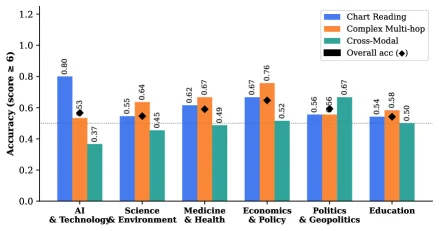
Figure 10: Chart-reading ACC ( τ = 6 \tau{=}6 , judge: GPT-5) by evidence position bucket ( n = 597 n{=}597 , 200 reports). Questions bucketed by relative chart position p = k / K p=k/K into equal thirds. Middle third is hardest for 4 of 6 models; Claude-Sonnet-4.5 steepest decline ( − - 11.7 pp). Figure 11: Gemini-3.1-Pro accuracy (ACC, τ = 6 \tau{=}6 ) per topic domain, grouped by question type. Black diamonds = overall accuracy per domain. Dashed line at 0.5. Based on the 57 domain-annotated reports (513 questions).

This figure (corresponding to Figure 11 in the paper) illustrates the accuracy (ACC, with a judgment threshold τ = 6) of the Gemini - 3.1 - Pro model across different topic domains, categorized by question types. It also shows the overall accuracy for each domain (marked by black diamonds). Here is a detailed explanation of each component in the figure:

Structure and Meaning of Components in the Figure

  • X - axis (Horizontal Axis): Represents different topic domains. From left to right, they are "AI & Technology", "Science & Environment", "Medicine & Health", "Economics & Policy", "Politics & Geopolitics", and "Education". These are the document topic categories divided in the study, used to analyze the model's performance in different domains.
  • Y - axis (Vertical Axis): Represents accuracy, with a range from 0.0 to 1.2 (although the actual accuracy should be between 0 and 1; here it may be a scale setting during plotting, and actual values like 0.37, 0.55, etc., are within a reasonable range). It is used to measure the proportion of correct answers given by the model in a specific domain and for a specific question type.
  • Different Colors of Bar Graphs:
  • Blue bars: Represent "Chart Reading" - type questions, that is, questions that require the model to understand the content of charts to answer.
  • Orange bars: Represent "Complex Multi - hop" - type questions. These questions require the model to reason by combining multiple information points or steps.
  • Turquoise bars: Represent "Cross - Modal" - type questions, which may involve the integration of multiple modal information such as text and images.
  • Black Diamonds (Overall acc): The black diamond above each domain marks the overall accuracy of that domain, that is, the average accuracy of the model on all questions (of different types) in that domain.
  • Dashed Line: There is a dashed line (y = 0.5) in the figure, which serves as a reference line for accuracy. Usually, 0.5 can be understood as the accuracy of random guessing (in the case of a binary classification problem). Here, it is used to intuitively compare whether the accuracy of each domain and each question type is higher than the random level.

Data Organization and Comparison Logic

  • Grouping by Topic Domain: Each topic domain is a group, and within the group, there are bar graphs for three question types ("Chart Reading", "Complex Multi - hop", "Cross - Modal") and a diamond mark for the overall accuracy. This grouping method allows us to compare the difficulty of different question types within the same domain (by the height of the accuracy) and the performance differences of the same question type across different domains.
  • Comparison of Question Types: Within the same domain, by the height of the bars of different colors, we can intuitively see which question type is more difficult for the model (the shorter the bar, the lower the accuracy). For example, in the "AI & Technology" domain, the accuracy of "Chart Reading" (0.80) is much higher than that of "Complex Multi - hop" (0.53) and "Cross - Modal" (0.37), indicating that the model performs well in handling chart - reading questions in this domain but poorly in cross - modal questions.
  • Comparison of Overall Accuracy: By the position of the black diamonds, we can compare the overall difficulty of different domains. For example, the overall accuracy of the "Economics & Policy" domain (about 0.67? We need to look at the specific values. In the figure, the diamond is above the orange bar, and the orange bar is 0.76? No, looking at the numerical annotations in the figure: the blue bar for "AI & Technology" is 0.80, the orange one is 0.53, the turquoise one is 0.37, and the diamond is 0.63; the blue bar for "Science & Environment" is 0.55, the orange one is 0.64, the turquoise one is 0.45, and the diamond is 0.45? Maybe I made a mistake. Let's look carefully. For "Medicine & Health", the blue bar is 0.62, the orange one is 0.67, the turquoise one is 0.49, and the diamond is 0.67; for "Economics & Policy", the blue bar is 0.67, the orange one is 0.76, the turquoise one is 0.52, and the diamond is 0.67; for "Politics & Geopolitics", the blue bar is 0.56, the orange one is 0.56, the turquoise one is 0.67, and the diamond is 0.56? For "Education", the blue bar is 0.54, the orange one is 0.58, the turquoise one is 0.50, and the diamond is 0.50.

How the Method Works (Inferred from the Figure)

This figure is based on the results of the "SynthDocBench" benchmark test. This benchmark test generates end - to - end documents through the LLM (Large Language Model) pipeline, covering six layout prototypes, and independently varies each factor (document length, layout structure, modality composition, question type) to achieve controlled analysis. For this figure, the specific methods are: 1. Data Generation: Use LLM to generate synthetic documents that contain different topic domains and question types (chart reading, complex multi - hop, cross - modal), ensuring that each factor (such as the topic domain) varies independently in the documents so as to analyze the model's performance in different domains. 2. Question Annotation and Evaluation: For the generated documents, design questions and annotate the answers, then use the Gemini - 3.1 - Pro model to answer the questions, and calculate the accuracy according to the judgment threshold τ = 6 (which may refer to the standard for judging the correctness of answers). 3. Grouping and Visualization: Group the questions by topic domain, and within the same domain, classify them by question type (chart reading, complex multi - hop, cross - modal). Calculate the accuracy of each type and the overall accuracy, and then visualize the results with bar graphs and diamond marks. The dashed line is used as a reference for the random accuracy level.

Conclusions (Results Obtained from the Figure)

  • Differences in Difficulty of Question Types: Within the same topic domain, there are significant differences in the accuracy of different question types. For example, the accuracy of "Chart Reading" questions in most domains (such as AI & Technology, Science & Environment, Medicine & Health, Economics & Policy) is higher than that of "Complex Multi - hop" and "Cross - Modal" questions, while the accuracy of "Cross - Modal" questions is usually the lowest, indicating that cross - modal questions are more challenging for the model.
  • Differences in Performance Between Domains: There are differences in the overall accuracy (black diamonds) of different topic domains. For example, the overall accuracy of the "Economics & Policy" and "Medicine & Health" domains is relatively high (about 0.67), while the overall accuracy of the "AI & Technology" domain is 0.63, that of the "Science & Environment" domain is 0.45, that of the "Politics & Geopolitics" domain is 0.56, and that of the "Education" domain is 0.50. This shows that the model's performance in different topic domains is inconsistent and may be affected by factors such as domain knowledge complexity and layout structure.
  • Universal Challenge of Cross - Modal Questions: In all domains, the accuracy of "Cross - Modal" questions is generally lower than that of the other two types of questions, indicating that the model has difficulties in integrating multiple modal information (such as charts and text). This is consistent with the failure pattern of "breakdown of chart comprehension in long - document settings" mentioned in the paper. Although this figure is grouped by topic domain, the low accuracy of cross - modal questions reflects the limitations of the model in processing multimodal information.

In summary, this figure visually shows the accuracy of the Gemini - 3.1 - Pro model in different topic domains and question types, reveals the universal challenge of the model in cross - modal questions and the performance differences in different domains and question types, and provides intuitive evidence for analyzing the behavior of visual document understanding models.

Figure 12: ACC ( τ = 6 \tau{=}6 ) by question subset. Cross-modal questions are consistently hardest across all models, confirming modality alignment as the primary bottleneck.

This figure (Figure 12) illustrates the accuracy (ACC) of various Vision-Language Models (VLMs) across different question subsets, where the accuracy is calculated with the condition τ=6 (i.e., accuracy based on at least 6 samples). The x-axis represents three main question subsets: Chart, Complex, and Cross-Modal. The y-axis indicates the accuracy, ranging from 0 to 1.

Each question subset contains multiple bar charts, each representing a different VLM model. The legend lists these models along with their corresponding colors: - Blue: Claude-Sonnet-4.5 - Green: Gemini-3.1-Pro - Orange: GPT-4o - Purple: GPT5.4 - Red: InternVL3-78B - Light green: Qwen2.5-VL-7B - Yellow: Qwen3.5-VL-122B - Dark blue: Qwen3-VL-235B

From the figure, we can observe: 1. In the Chart subset, Gemini-3.1-Pro achieves the highest accuracy of 0.76, while Qwen2.5-VL-7B has the lowest accuracy of 0.16. 2. In the Complex subset, Qwen3.5-VL-122B has the highest accuracy of 0.69, and Qwen2.5-VL-7B still has the lowest accuracy of 0.01. 3. In the Cross-Modal subset, the accuracy of all models is generally low, with Qwen3-VL-235B achieving the highest accuracy of 0.56, and Qwen2.5-VL-7B having the lowest accuracy of 0.07.

This figure reveals that cross-modal questions are consistently the hardest across all models, confirming that modality alignment is the primary bottleneck. By comparing the performance of different models across different question subsets, it is evident that models generally have lower accuracy in handling cross-modal questions compared to chart and complex questions.

In summary, this figure demonstrates, through the accuracy of different VLMs across various question subsets, that cross-modal questions pose a significant challenge for current VLMs in long-context visual document understanding.

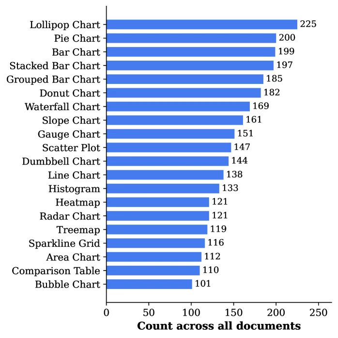
Figure 13: Distribution of chart types (top 20 shown). The corpus covers 24 distinct types spanning common (bar, line, scatter) and specialized (dumbbell, sankey, lollipop) forms.

This figure (Figure 13) illustrates the distribution of different chart types within the corpus used in this study. It is a horizontal bar chart designed to visualize this data.

On the left side of the chart, various chart type names are listed, from top to bottom: Lollipop Chart, Pie Chart, Bar Chart, Stacked Bar Chart, Grouped Bar Chart, Donut Chart, Waterfall Chart, Slope Chart, Gauge Chart, Scatter Plot, Dumbbell Chart, Line Chart, Histogram, Heatmap, Radar Chart, Treemap, Sparkline Grid, Area Chart, Comparison Table, and Bubble Chart. These represent the top 20 most common chart types found in the corpus, out of a total of 24 distinct types.

To the right of each chart type name is a blue horizontal bar whose length corresponds to the count of that chart type. The longer the bar, the more frequently that chart type appears in the corpus. For instance, the Lollipop Chart has the highest count at 225, followed by the Pie Chart (200) and the Bar Chart (199). The chart type with the lowest count shown in this figure is the Bubble Chart, with 101 instances.

The X-axis (horizontal axis) is labeled "Count across all documents," indicating the total number of times each chart type appears throughout the entire corpus. The numerical range on this axis extends from 0 to 250.

This figure reveals several key aspects about the corpus: 1. Diversity: The corpus includes 24 different chart types, encompassing both common types (e.g., bar charts, line charts, scatter plots) and specialized types (e.g., dumbbell charts, Sankey-like charts implied by "sankey" in the caption, lollipop charts). This diversity is crucial for evaluating how well vision-language models can generalize across different visual representations. 2. Frequency Distribution: The chart shows the frequency distribution of the top 20 chart types. It highlights that some chart types (e.g., lollipop charts, pie charts, standard bar charts) are much more prevalent than others (e.g., bubble charts). This information is vital for interpreting model performance, as models might excel on common chart types but struggle with rarer ones. 3. Methodological Implication: This chart is part of the methodology for constructing the SynthDocBench benchmark. By systematically controlling factors like document length, layout, modality, and question type, researchers can analyze model behavior under controlled conditions. Knowing the distribution of chart types helps in understanding potential strengths and weaknesses of models. For example, if a model performs poorly on lollipop charts, and these are common in the corpus, this is a significant finding.

In summary, this figure provides a clear visualization of the frequency distribution of various chart types in the study's corpus, emphasizing its diversity and the prevalence of certain types, which is essential for assessing the performance of visual document understanding models.

← → flip · ↑ ↓ scroll notes · Esc exit