🌊 Tide

Information moves like the tide. We pick the waves worth studying.

中文

← Today's tide

Published 2026-07-09 · EPFL · Matteo Santelmo, Xiuying Wei, Israa Fakih et al.

Blind-Spots-Bench: Evaluating Blind Spots in Multimodal Models

arXiv · HuggingFace · ▲31

Abstract (verbatim)

Modern AI models achieve strong performance on many established benchmarks, yet they still fail on tasks that humans find almost trivial, such as manipulating a string or drawing a dog with five legs. These examples suggest that existing benchmarks may under-measure persistent blind spots in current systems. We introduce blind-spots-bench, a benchmark designed to expose such blind spots through tasks that appear simple for humans but remain challenging for modern AI. We collect raw questions from students in an AI course, clean and annotate them with structured reference solutions, and propose a task taxonomy tailored to the resulting dataset of 235 samples. We further develop an automated grading pipeline to evaluate a wide range of models, including open-weight and closed-source language, vision-language, and image-generation models. Our analysis on blind-spots-bench reveals that closed-source frontier models can substantially outperform open-weight models with even approx10% gap, even when they attain comparable performance on existing benchmarks. A more fine-grained analysis shows that no single model dominates across all task types, and that some tasks remain challenging for all evaluated models. These results highlight the value of blind-spots-bench as a diagnostic stress test for identifying concrete weaknesses in current modern models.

Background

Background Analysis

1. Technical Context
Recent advances in large language models (LLMs) and multimodal models have enabled strong performance in tasks like mathematics, coding, and vision. These models are widely used in education, healthcare, and content creation—for example, assisting students with math problems, helping doctors analyze medical images, or generating high-quality text and images. However, they often fail at tasks that are trivial for humans, such as generating a string of a specific length, drawing an image with unusual details (e.g., a dog with five legs), or solving a basic Sudoku. This discrepancy highlights "blind spots" in AI systems, particularly in areas like spatial reasoning, logical consistency, and character-level manipulation.

2. Previous Limitations
While existing benchmarks (e.g., MMLU, ImageNet) show models performing near or above human levels, they often focus on broad task categories rather than fine-grained weaknesses. For instance, a benchmark might test if a model can recognize a cat but not if it can generate a cat with exactly four eyes—a task humans complete easily. Additionally, many benchmarks rely on automated scoring, which struggles to capture subtle failures in open-ended tasks. This creates a need for more targeted methods to expose these "hidden weaknesses."

3. Proposed Solution
To address this, the paper introduces "Blind-Spots-Bench," a dataset of 235 manually curated tasks collected from AI students’ submissions about problems current models fail to solve. These tasks cover three main categories: object-centric tasks (e.g., counting, spatial reasoning), abstract reasoning (e.g., math and logic), and language/knowledge tasks (e.g., linguistic understanding). Each task includes structured reference solutions and an automated grading pipeline to evaluate 38 models (including LLMs, VLMs, and image-generation models). This approach quantifies model weaknesses while revealing performance differences across task types.

4. Key Differences from Prior Work
Compared to existing research, this work stands out by:
- Task Design: Focusing on "easy for humans, hard for AI" scenarios rather than traditional benchmarks.
- Evaluation Method: Combining automated grading with manual auditing for reliability.
- Task Taxonomy: Introducing a fine-grained classification system to analyze model strengths and weaknesses in detail.
- Model Coverage: Comparing open-source and closed-source models, revealing significant performance gaps (e.g., closed-source models outperform open-source ones by ~10% on some tasks).

This approach provides a systematic tool to identify and address multimodal models' hidden limitations.
Method, Figure by Figure

M E T H O D1 / 9

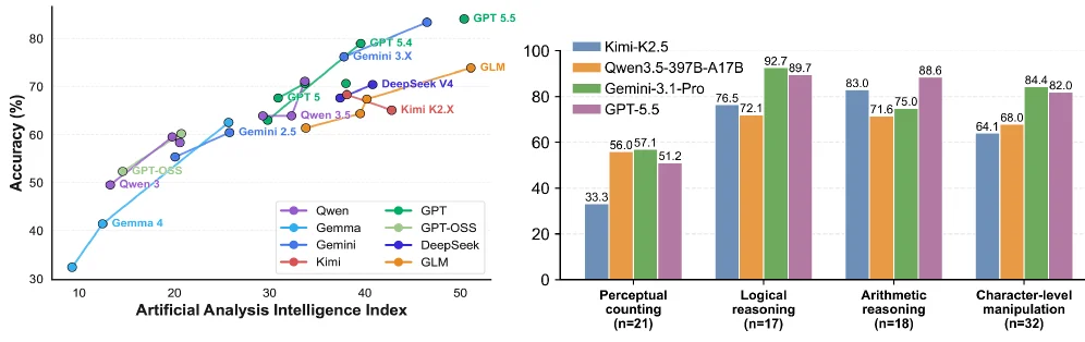
Figure 1 : Left : Accuracy on blind-spots-bench vs. Artificial Analysis Intelligence Index score for text-only problems. Right: Performance of four VLM models on several sub-tasks.

This figure is from the paper "Blind-Spots-Bench: Evaluating Blind Spots in Multimodal Models" and is divided into two main sections, illustrating findings from the proposed "blind-spots-bench" for assessing modern AI models.

Left Panel: Accuracy on Text Problems vs. Artificial Analysis Intelligence Index

  • Chart Type and Purpose: This is a scatter plot (or a line plot, as data points seem connected by a trend) showing the relationship between a model's "Artificial Analysis Intelligence Index" and its accuracy on text-only problems from the "blind-spots-bench."
  • X-axis: Labeled "Artificial Analysis Intelligence Index," with values ranging from 10 to 50. This index likely measures a model's comprehensive ability to handle tasks requiring human-like analytical skills, where higher values indicate greater capability.
  • Y-axis: Labeled "Accuracy (%)," ranging from 30% to 80%. This represents the percentage of correct answers a model achieved on the text problems in the "blind-spots-bench."
  • Data Series and Trend:
    • The plot includes multiple data series, each represented by different colored markers for various models, such as GPT series (green), Gemini series (blue), GPT-OSS (light green), DeepSeek (purple), Qwen (pink), Kimi (red), and GLM (orange).
    • Data points generally follow an upward trend from the bottom-left to the top-right, indicating that a higher "Artificial Analysis Intelligence Index" correlates with higher accuracy on "blind-spots-bench" text problems. For instance, GPT 5.5 (green marker) has an accuracy near 80% when its index is around 50, while Gemma 4 (blue marker) has an accuracy of about 30% with an index around 10.
  • Information Flow: The viewer first understands the axes definitions, then identifies the models by their colors. By tracing the data points for each model, one can comprehend the positive correlation between the "Artificial Analysis Intelligence Index" and performance on "blind-spots-bench" text accuracy. The conclusion is that higher "Artificial Analysis Intelligence Index" scores are associated with better performance on these specific text problems.

Right Panel: Performance of Four VLM Models on Sub-tasks

  • Chart Type and Purpose: This is a bar chart comparing the performance of four specific Visual Language Models (VLMs) across four different sub-tasks.
  • X-axis: Represents four sub-tasks:
    • Perceptual counting (n=21): Perception and counting, with 21 samples.
    • Logical reasoning (n=17): Logical problem-solving, with 17 samples.
    • Arithmetic reasoning (n=18): Arithmetic problem-solving, with 18 samples.
    • Character-level manipulation (n=32): Manipulating strings or characters, with 32 samples.
  • Y-axis: Labeled "Performance," with values ranging from 0 to over 100 (e.g., 92.7, 89.7 in Logical Reasoning). This represents the performance score of each model on each sub-task, likely accuracy or a similar metric.
  • Data Series and Comparison:
    • Four colors of bars represent four models:
      • Blue: Kimi-K2.5
      • Orange: Qwen3.5-397B-A17B
      • Green: Gemini-3.1-Pro
      • Purple: GPT-5.5
    • For each sub-task, the performance of these four models is displayed side-by-side for direct comparison:
      • In "Perceptual counting," GPT-5.5 (purple, ~51.2) performs slightly better than Gemini-3.1-Pro (green, ~50.71 or 51.2), followed by Qwen3.5-397B-A17B (orange, 56.05), and Kimi-K2.5 (blue, 33.3) performs the lowest.
      • In "Logical reasoning," Gemini-3.1-Pro (green, 92.7) and GPT-5.5 (purple, 89.7) perform best, followed by Qwen3.5-397B-A17B (orange, 76.5), and then Kimi-K2.5 (blue, 72.1).
      • In "Arithmetic reasoning," GPT-5.5 (purple, 88.6) performs best, followed by Gemini-3.1-Pro (green, 76.0), Qwen3.5-397B-A17B (orange, 71.6), and Kimi-K2.5 (blue, ~83.0 or 76.0 – GPT-5.5 appears highest).
      • In "Character-level manipulation," GPT-5.5 (purple, 82.0) and Gemini-3.1-Pro (green, 84.4) perform best, followed by Qwen3.5-397B-A17B (orange, 68.0), and Kimi-K2.5 (blue, 64.1) performs the lowest.
  • Information Flow: The viewer first identifies the sub-tasks on the X-axis and the performance metric on the Y-axis. By observing the heights of the bars for each color (model), one can compare the performance of the four VLMs across each sub-task. The conclusion is that performance varies across models and sub-tasks, with no single model dominating all tasks. For example, GPT-5.5 performs well in many tasks but is slightly outperformed by Gemini-3.1-Pro in "Character-level manipulation"; Kimi-K2.5 generally shows relatively weaker performance.

Overall Method and Conclusion (Based on the Figure and Abstract):

This figure demonstrates the application of the "blind-spots-bench." The left panel shows a positive correlation between a model's "Artificial Analysis Intelligence Index" and its accuracy on "blind-spots-bench" text problems, suggesting the index might be a useful evaluative dimension. The right panel specifically compares the performance of four VLMs across four different sub-tasks, revealing performance differences and specific task challenges.

In conjunction with the paper's abstract, this method (using "blind-spots-bench") aims to expose weaknesses in modern AI models on tasks that are simple for humans but challenging for current systems. The results indicate that even state-of-the-art closed-source models (like GPT-5.5, Gemini-3.1-Pro) might show a significant advantage (about a 10% gap) on "blind-spots-bench" compared to open-weight models (like Qwen, Kimi), even when their performance is comparable on existing benchmarks. A finer-grained analysis shows that no single model dominates across all task types, and some tasks remain challenging for all evaluated models. These results highlight the value of "blind-spots-bench" as a diagnostic stress test for identifying concrete weaknesses in current modern models.

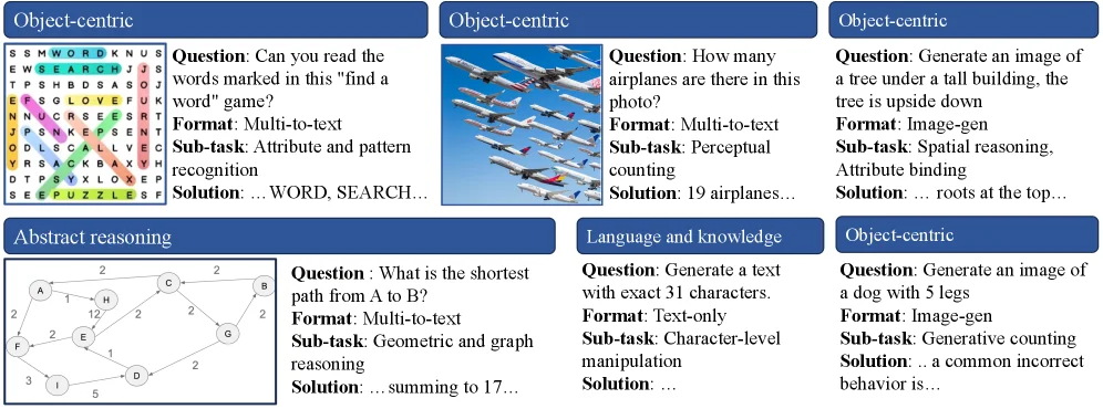
Figure 2 : Representative examples from the dataset. While these tasks are generally easy for human, we find that they remain challenging for frontier models. Each example is annotated with its solution (an abbreviated version here), question format, task and sub-task categories, illustrating the diversity of skills evaluated in the benchmark. Full taxonomy and additional examples in Appendix A .

This figure is from the paper "Blind - Spots - Bench: Evaluating Blind Spots in Multimodal Models" and shows representative examples from the dataset. The purpose is to illustrate that tasks that are usually simple for humans remain challenging for cutting - edge models.

Let's analyze each component: - Top - left "Object - centric" panel: On the left is a grid similar to a word - search game (with letters and color marks). On the right, there is a question ("Can you read the words marked in this 'find a word' game?"), the format (Multi - to - text), the sub - task (Attribute and pattern recognition), and part of the solution ("... WORD, SEARCH..."). The data flow here is from the visual input (the grid) to the question, then to the task classification and the solution display. This is used to evaluate the model's ability in attribute and pattern recognition. - Upper - middle "Object - centric" panel: On the left is a picture of airplanes. On the right, there is a question ("How many airplanes are there in this photo?"), the format (Multi - to - text), the sub - tasks (Perceptual counting, Attribute binding), and part of the solution ("19 airplanes..."). The flow is from the image input (the airplane picture) to the question, then to the task classification and the solution. It is used to evaluate the model's perceptual counting and attribute binding abilities. - Top - right "Object - centric" panel: The question is "Generate an image of a tree under a tall building, the tree is upside down". The format is Image - gen, the sub - tasks are Spatial reasoning, Attribute binding, and part of the solution is "... roots at the top...". Here, the text input (the question description) leads to the image - generation task. It is used to evaluate the model's spatial reasoning and attribute binding abilities to generate a compliant image. - Bottom - left "Abstract reasoning" panel: On the left is a geometric figure (a graph structure with nodes, edges, and number marks). On the right, there is a question ("What is the shortest path from A to B?"), the format (Multi - to - text), the sub - task (Geometric and graph reasoning), and part of the solution ("... summing to 17..."). The flow is from the graph structure input to the question, then to the task classification and the solution. It is used to evaluate the model's geometric and graph reasoning abilities. - Bottom - middle "Language and knowledge" panel: The question is "Generate a text with exact 31 characters.". The format is Text - only, the sub - task is Character - level manipulation, and part of the solution is "...". Here, the text input (the question) leads to the text - generation task. It is used to evaluate the model's character - level operation ability. - Bottom - right "Object - centric" panel: The question is "Generate an image of a dog with 5 legs". The format is Image - gen, the sub - task is Generative counting, and part of the solution is "... a common incorrect behavior is...". Here, the text input leads to the image - generation task. It is used to evaluate the model's generative counting ability (generating an image of a dog with 5 legs).

The method demonstration logic of this figure is: By collecting different types of tasks (including visual tasks, abstract reasoning tasks, language knowledge tasks, etc.), each task has a corresponding question, input format (such as multi - modal to text, text - only, image generation, etc.), sub - task category (such as attribute and pattern recognition, perceptual counting, spatial reasoning, etc.), and solution (partially displayed). This reflects the diversity of the benchmark. The design of these tasks aims to find the weaknesses of current modern models (including open - source and closed - source language, vision - language, and image - generation models) in tasks that seem simple but are difficult for humans.

From the result perspective (although this is mainly an example rather than a traditional result figure, the evaluation logic of the method can be inferred): These examples show different task types. Subsequently, by automatically scoring various models (open - source and closed - source) on these tasks, it is found that cutting - edge closed - source models may have a significant performance advantage over open - source weighted models (even when their performance is comparable in existing benchmarks). Moreover, no single model can dominate across all task types, and some tasks still pose challenges to all evaluated models. This reflects the value of blind - spots - bench as a diagnostic stress test, which is used to identify the specific weaknesses of current modern models.

In summary, this figure, by showing different types of task examples (including input, question, format, sub - task, and solution), explains the diversity of the blind - spots - bench dataset and how to evaluate the weaknesses of models through these tasks, providing an intuitive task example basis for subsequent model evaluation and analysis.

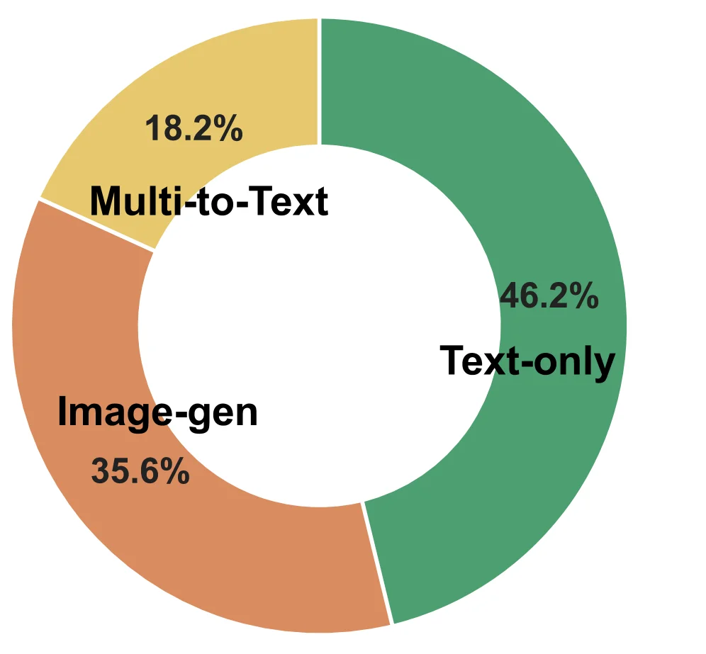
Figure 3 : Left: Question format composition. Right: Task category composition. Some questions (about 15) involve multiple subtask categories; for these cases, we count one occurrence for each applicable subtask. The bar chart reports the total number of occurrences for each fine-grained task category, grouped into three major categories.

This figure (Figure 3, right panel, inferred from the original caption) is a donut chart (a variation of a pie chart) illustrating the "Task category composition." It clearly categorizes the collected questions (totaling 235 samples) based on their primary task types, representing the proportion of each type as a percentage.

The main components of the chart include three differently colored sectors, each representing a primary task category:

  1. Green Sector: This sector occupies the largest portion of the chart and is labeled "Text-only," showing a percentage of 46.2%. This indicates that 46.2% of all questions fall into the "Text-only" type. These tasks likely involve text processing, text understanding, or text generation without requiring image input or output.

  2. Orange Sector: This sector is labeled "Image-gen" and displays a percentage of 35.6%. This means 35.6% of the questions are categorized as "Image-gen" (image generation). These tasks require the model to generate new images, for example, creating an image based on a text description.

  3. Yellow Sector: This sector is labeled "Multi-to-Text" and shows a percentage of 18.2%. This indicates that 18.2% of the questions belong to the "Multi-to-Text" type. These tasks might involve extracting information from multiple input modalities (e.g., image and text) and outputting results in textual form.

According to the original caption, this data is based on grouping fine-grained task categories from 235 samples into three major categories. The caption also explains that some questions (about 15) involve multiple subtask categories; in such cases, each applicable subtask is counted once for every occurrence of the question. This means the percentages in the chart are based on this counting method for total occurrences.

This chart reveals the distribution of task types within the Blind-Spots-Bench dataset. It shows the relative prevalence of different task types, with "Text-only" tasks being the most frequent, followed by "Image-gen" tasks, and then "Multi-to-Text" tasks. This distribution is crucial for understanding the focus of the benchmark and how models might perform across different task types. For instance, if a model performs well on "Text-only" tasks but poorly on "Image-gen" or "Multi-to-Text" tasks, it might indicate blind spots in those specific task areas.

The flow of information in the chart is from individual question instances to their respective task categories, then aggregating these categories into three main ones, and visualizing them as percentages. By observing the size of the different colored sectors and their corresponding percentages, a reader can quickly grasp the relative importance of different task types within the dataset.

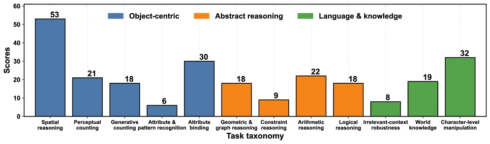
Figure 3 : Left: Question format composition. Right: Task category composition. Some questions (about 15) involve multiple subtask categories; for these cases, we count one occurrence for each applicable subtask. The bar chart reports the total number of occurrences for each fine-grained task category, grouped into three major categories.

This figure is Figure 3 (right panel), titled "Task category composition" from the paper "Blind-Spots-Bench: Evaluating Blind Spots in Multimodal Models." It illustrates the distribution of tasks within the benchmark dataset across various fine-grained task categories, which are then grouped into three major overarching categories. The dataset comprises 235 samples.

Let's break down the components of the graph:

  • X-axis (Horizontal Axis): Labeled "Task taxonomy," it lists specific fine-grained task categories. From left to right, these are: Spatial reasoning, Perceptual counting, Generative counting, Attribute & pattern recognition, Attribute binding, Geometric & graph reasoning, Constraint reasoning, Arithmetic reasoning, Logical reasoning, Irrelevant-context robustness, World knowledge, and Character-level manipulation. Each of these represents a specific type of task the models are evaluated on.
  • Y-axis (Vertical Axis): Labeled "Scores," but according to the caption, this actually represents the "total number of occurrences" (i.e., how many times each fine-grained task category appears in the dataset).
  • Legend: Located at the top, it defines the color coding for three main categories:
    • Blue (Object-centric): Tasks focused on objects.
    • Orange (Abstract reasoning): Tasks involving abstract thinking.
    • Green (Language & knowledge): Tasks related to language understanding and knowledge.
  • Data Bars: Each fine-grained task category on the X-axis has one or more bars associated with it, colored according to its main category. The height of each bar indicates the number of times that specific task category appears in the dataset.

The caption explains the methodology for counting: "Some questions (about 15) involve multiple subtask categories; for these cases, we count one occurrence for each applicable subtask. The bar chart reports the total number of occurrences for each fine-grained task category, grouped into three major categories." This means: 1. Data Collection: The benchmark includes 235 sample tasks. 2. Task Classification: Each task can belong to one or more fine-grained subtask categories. 3. Counting Method: If a question involves multiple subtask categories, it is counted once for each applicable category. Therefore, the total counts in the chart (which sum to more than 235 if added across all bars) represent the cumulative occurrences of each fine-grained category, not the number of unique tasks. 4. Grouping: These fine-grained categories are then aggregated into three broader categories (object-centric, abstract reasoning, language & knowledge) for reporting.

Analyzing the data and information flow: - Object-centric (Blue): - Spatial reasoning: 53 occurrences, the highest among all categories. - Perceptual counting: 21 occurrences. - Generative counting: 18 occurrences. - Attribute & pattern recognition: 6 occurrences. - Attribute binding: 30 occurrences. - These tasks focus on perceiving, counting, generating, and binding attributes of objects. - Abstract reasoning (Orange): - Geometric & graph reasoning: 18 occurrences. - Constraint reasoning: 9 occurrences. - Arithmetic reasoning: 22 occurrences. - Logical reasoning: 18 occurrences. - These tasks involve logical, arithmetic, and geometric thinking. - Language & knowledge (Green): - Irrelevant-context robustness: 8 occurrences. - World knowledge: 19 occurrences. - Character-level manipulation: 32 occurrences, the highest among the green (language & knowledge) category. - These tasks involve language understanding, knowledge application, and character manipulation.

The flow of information is from specific task instances (the categories on the X-axis) to their frequency of occurrence (the values on the Y-axis), and then categorizing these frequencies into broader task types using colors. This graph reveals the composition of tasks in the Blind-Spots-Bench benchmark, showing which types of tasks are more prevalent. For instance, object-centric tasks like spatial reasoning are numerically dominant, while character-level manipulation is prominent within the language & knowledge category. This visualization helps understand the benchmark's focus and coverage, providing a basis for evaluating model performance across different task types.

Conclusion: This graph clearly displays the task composition of the Blind-Spots-Bench benchmark by counting the occurrences of fine-grained task categories and grouping them into three main categories. It reveals which types of tasks are more common in the benchmark, thus providing a basis for assessing model performance on these potential blind-spot tasks.

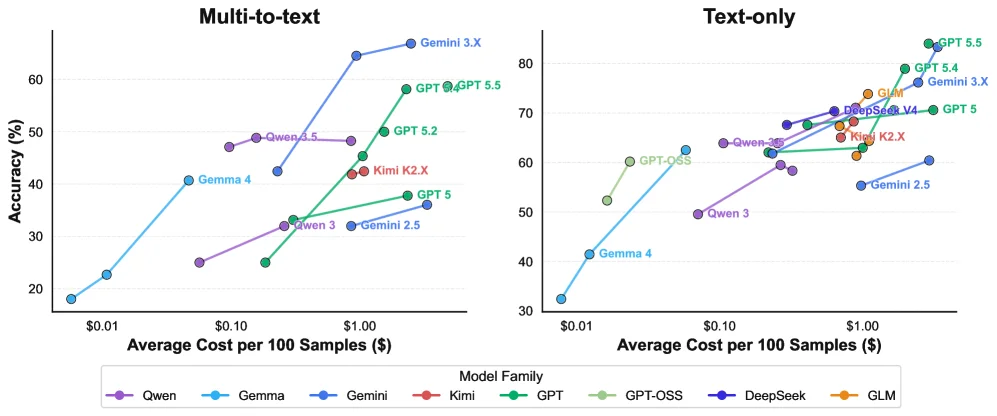
Figure 4 : Accuracy on blind-spots-bench vs. average cost for 100 samples. Colors distinguish model families; models of the same version but different sizes are connected.

This figure (Figure 4) from the paper "Blind-Spots-Bench: Evaluating Blind Spots in Multimodal Models" illustrates the relationship between the accuracy of different AI models on the "blind-spots-bench" benchmark and the average cost to process 100 samples.

First, let's understand the structure of the figure. It consists of two side-by-side subplots, labeled "Multi-to-text" on the left and "Text-only" on the right. These subplots represent two different types of tasks or evaluation scenarios: "multimodal-to-text" (where models might process images or other modalities to produce text) and "text-only" tasks. This division helps us understand how models perform on different kinds of challenges.

The X-axis (horizontal axis) of both subplots is labeled "Average Cost per 100 Samples ($)". This represents the average cost, in dollars, to process 100 samples. The values increase from left to right, indicating a progression from lower to higher costs. The Y-axis (vertical axis) is labeled "Accuracy (%)", representing the percentage accuracy of the models on the benchmark. Values increase from bottom to top, indicating higher accuracy.

Data points in the graph are represented by colored circles, with each color corresponding to a different "Model Family," as indicated by the legend at the bottom: - Purple for Qwen (e.g., Qwen 3, Qwen 4.5) - Light blue for Gemma (e.g., Gemma 4, Gemma 2.5) - Dark blue for Gemini (e.g., Gemini 3.X, Gemini 2.5) - Red for Kimi (e.g., Kimi K2.X) - Green for GPT (e.g., GPT 5, GPT 5.2, GPT 5.5) - Light green for GPT-OSS - Another dark blue shade for DeepSeek (e.g., DeepSeek V4) - Orange for GLM

A key piece of information is that models of the same version but different sizes are connected by lines. This allows us to observe the trade-off between cost and accuracy for different scales of the same model family.

Now, let's interpret what this figure reveals about the method and its results:

  1. Methodology (How the Data was Generated):

    • The data presented is based on the "blind-spots-bench" benchmark. This benchmark is designed to evaluate modern AI models on tasks that are simple for humans but challenging for AI.
    • The process involves collecting questions (from AI course students), cleaning and annotating them with reference solutions, and then using an automated grading pipeline to assess the performance of various models.
    • Each data point in the graph represents the accuracy of a specific model on "blind-spots-bench" and the average cost to run that model on 100 samples.
  2. Results and Interpretation:

    • Cost vs. Accuracy Relationship: Generally, as the cost per 100 samples increases (moving right on the X-axis), the accuracy of the models also tends to increase (moving up on the Y-axis). This suggests that more powerful or complex models (which typically have higher costs) perform better on these benchmarks.
    • Comparison Across Model Families:
      • In the "Multi-to-text" subplot, the Gemini 3.X model achieves the highest accuracy (over 60%) at a relatively high cost (around $1.00). GPT series models (e.g., GPT 5.5, GPT 5.2) also perform well, especially at higher costs. Models like Qwen 4.5 and Kimi K2.X show good performance at moderate costs.
      • In the "Text-only" subplot, GPT 5.5 and GPT 5.4 achieve the highest accuracy (over 80%) at higher costs (above $1.00). Other models like GLM, DeepSeek V4, and Kimi K2.X also show better performance at higher costs.
    • Trade-offs Within Model Families: For example, in the "Multi-to-text" subplot, different versions of the GPT series (GPT 5, GPT 5.2, GPT 5.5) are connected by a line, showing that as cost increases, accuracy also improves. Similarly, Gemma (Gemma 4 vs Gemma 2.5) and Qwen (Qwen 3 vs Qwen 4.5) show such cost-accuracy trade-offs.
    • Key Conclusions:
      • Cost-Performance Trade-off: The figure clearly shows a positive correlation between cost and accuracy. Higher computational or resource costs generally lead to higher accuracy.
      • Performance Differences Between Model Families: Different model families exhibit significant differences in their cost and accuracy performance. For instance, at certain cost ranges, the GPT series might outperform others (like Gemma or certain versions of Qwen).
      • No Single Optimal Model: The figure indicates that no single model family dominates across all cost levels and all task types ("Multi-to-text" vs "Text-only"). Different models may perform better under different cost conditions or for different task types.
      • Challenging Nature of Tasks: Even for the best-performing models, achieving very high accuracy requires a certain level of investment in cost, suggesting the inherent challenge of these "blind-spot" tasks.

In summary, this figure visualizes the relationship between the accuracy and cost of different AI models on the "blind-spots-bench" benchmark. It reveals that while more powerful models generally achieve better accuracy, different model families perform differently across costs and task types, and no single model is optimal in all aspects. This visualization helps in understanding the strengths and weaknesses of different models, aiding researchers and developers in selecting appropriate models for specific applications.

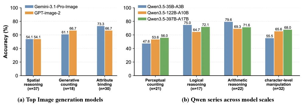
Figure 5 : Performance comparison of leading image generation and VLM models on the largest-sample subtasks within each model type.

This figure is from the paper Blind-Spots-Bench: Evaluating Blind Spots in Multimodal Models and illustrates the performance comparison of different models on specific subtasks. We can break it down into two main sections for a detailed interpretation:

First, we look at the left section, labeled (a) "Top Image generation models". This part uses bar charts to compare the accuracy (in percentage) of two image generation models across different subtasks. The x-axis represents different subtasks, including "Spatial reasoning" (sample size n=37), "Generative counting" (sample size n=18), and "Attribute binding" (sample size n=30). The y-axis indicates accuracy (%). For each subtask, there are two bars, representing the performance of "Gemini-3.1-Pro-Image" (blue) and "GPT-image-2" (orange), respectively. For example, in the "Spatial reasoning" task, both models have an accuracy of 54.1%; in the "Generative counting" task, "Gemini-3.1-Pro-Image" has an accuracy of 61.1%, while "GPT-image-2" is 66.7%. This section shows the performance differences of top image generation models across different types of tasks.

Next, the right section, labeled (b) "Qwen series across model scales", also uses bar charts but compares the performance of different scale models within the same series (Qwen) on various subtasks. The x-axis lists different subtasks, such as "Perceptual counting" (sample size n=21), "Logical reasoning" (sample size n=17), "Arithmetic reasoning" (sample size n=22), and "character-level manipulation" (sample size n=32). The y-axis is still accuracy (%). For each subtask, there are three bars, representing the performance of "Qwen3.5-35B-A3B" (blue), "Qwen3.5-122B-A10B" (orange), and "Qwen3.5-397B-A17B" (green), respectively. For instance, in the "Perceptual counting" task, the accuracies of these three models are 47.6%, 53.6%, and 56.0%, respectively. This section reveals how changes in model scale within the same series affect their performance across different tasks.

Overall, this figure reveals the following methods and conclusions: 1. Method: The figure demonstrates how to evaluate different types of models (image generation models and language models) on a specific benchmark (blind-spots-bench). By selecting the best-performing models within each model type and comparing them on the largest-sample subtasks of the benchmark, the performance differences of the models can be clearly shown. 2. Conclusions: - Different image generation models exhibit varying performance across different subtasks. For example, "GPT-image-2" outperforms "Gemini-3.1-Pro-Image" in the "Generative counting" task, while both perform equally in the "Spatial reasoning" task. - The performance of different scale models within the same series also varies across various subtasks. Generally, larger models perform better on some tasks, but not all. For example, "Qwen3.5-397B-A17B" performs best in "Logical reasoning" and "Arithmetic reasoning" tasks, but in the "character-level manipulation" task, "Qwen3.5-122B-A10B" outperforms the other two models. - These results indicate that no single model dominates across all task types, and some tasks remain challenging for all evaluated models. This highlights the value of blind-spots-bench as a diagnostic stress test for identifying specific weaknesses in current modern models.

In summary, this figure, through detailed performance comparisons, shows the performance differences of different models on specific subtasks, helping us understand the strengths and weaknesses of the models.

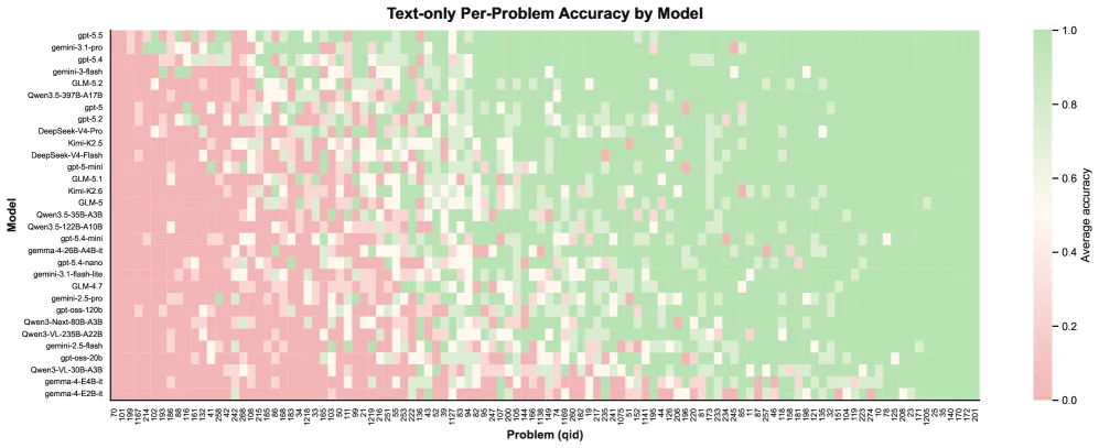
Figure 6 : Average accuracy for each model on each task, on text-only problems.

This figure (Figure 6) displays the average accuracy of each model on individual "text-only problems." It is a heatmap that uses color coding to intuitively illustrate the performance of different models across various tasks.

First, let's examine the components of the figure:

  1. Title: "Text-only Per-Problem Accuracy by Model" clearly indicates that the figure shows the per-problem accuracy of each model on text-only problems.
  2. Y-axis (Vertical Axis) - Model: The left-side Y-axis lists the various models being evaluated. These models are arranged in a certain order (possibly by overall performance, name, or another criterion), from top to bottom: gpt-4-5, gemma-31-pro, gpt-5-4, gpt-4-flash, GLM-4-2, etc. Each model name represents a distinct AI model.
  3. X-axis (Horizontal Axis) - Problem (qid): The bottom X-axis represents different problems or tasks. Each position corresponds to a specific problem, identified by a qid (problem ID). Problems are arranged from left to right.
  4. Color Bar - Right Side: The color bar on the right is a legend for the color coding. It shows the correspondence between colors and "Average accuracy." The colors gradient from red (or pink) to green:
    • Red/Pink: Represents lower accuracy, close to 0.0.
    • White: Represents moderate accuracy, approximately between 0.4 and 0.6 (inferred from the color bar's scale).
    • Green: Represents higher accuracy, close to 1.0. The more green a color is, the better the model's performance on that problem; the more red a color is, the worse the performance.
  5. Data Cells: Each small square (pixel) in the figure represents the average accuracy of a specific model on a specific problem. The color of the square is determined by the color bar described above. For example, if a square is dark green, it means the corresponding model has high accuracy on that problem; if it's red, the accuracy is low.

Revealing How the Method Works (How the Result Was Obtained):

This figure is based on the results of the "Blind-Spots-Bench" benchmark. This benchmark aims to evaluate the performance of modern AI models on tasks that seem simple to humans but remain challenging for AI. Specifically for this figure:

  1. Data Collection and Annotation: Researchers collected original problems from AI course students, then cleaned and annotated them, providing structured reference solutions.
  2. Task Taxonomy: They developed a task taxonomy for these datasets (a total of 235 samples).
  3. Automated Scoring Pipeline: To evaluate various models (including open-source and closed-source language models, vision-language models, and image generation models), they developed an automated scoring pipeline.
  4. Evaluation: This automated pipeline was used to assess the performance of each model on "text-only" problems. For each model and each problem, the system calculated its average accuracy.
  5. Visualization: Finally, this average accuracy data was presented as a heatmap, where the Y-axis represents models, the X-axis represents problems, and the color represents accuracy.

Coordinates, Comparison Objects, and Conclusions:

  • Coordinates:
    • Y-axis coordinates are different model names.
    • X-axis coordinates are different problem IDs (qid).
    • Color coordinates correspond to average accuracy (from 0.0 to 1.0).
  • Comparison Objects:
    • Comparison between different models: By comparing the shades of color in the same row (same problem), you can determine which model performs better on that problem.
    • Comparison of the same model on different problems: By comparing the shades of color in the same column (same model), you can determine the performance differences of that model across different problems.
  • Conclusions (Intuitively Derived from the Figure):
    • Significant Model Performance Differences: The performance of different models on the same problem varies greatly. Some models show green (high accuracy) on most problems, while others show more red or white (low or moderate accuracy).
    • Task Difficulty Differences: Certain problems (i.e., certain X-axis positions) appear red or white for almost all models, indicating that these tasks are generally challenging for current AI models.
    • No "All-Round" Model: No model shows green on all problems. This indicates that different models have their own strengths and weaknesses for different task types.
    • Overall Trend: From the right side of the figure (possibly representing simpler or more common tasks) to the left side (possibly representing harder or more specialized tasks), the overall accuracy of models seems to decrease, or the red areas increase. However, a more accurate interpretation is that the performance differences of models across different problems are significant.

In summary, this heatmap clearly illustrates the performance distribution of different AI models on "text-only" tasks, revealing that certain tasks are challenging for all models and also showing the performance differences between models. This is consistent with the findings mentioned in the paper's abstract, which states that no single model dominates across all task types, and certain tasks remain challenging for all evaluated models.

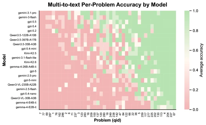
Figure 7 : Average accuracy for each model on each task, on multi-to-text problems.

This figure (Figure 7) is from the paper "Blind-Spots-Bench: Evaluating Blind Spots in Multimodal Models," and its core purpose is to display the average accuracy of different models on "multi-to-text" problems. We can interpret this figure in detail from the following aspects:

1. Structure and Components of the Figure

  • Title: "Multi-to-text Per-Problem Accuracy by Model" clearly indicates that the figure shows the average accuracy (Accuracy) of different models (by Model) on each problem (Per-Problem) in the "multi-to-text" task.
  • Y-axis (Vertical Axis): Labeled "Model," it lists various models involved in the evaluation. These models are arranged in a certain order, from top to bottom as follows:
  • gemini-3.1-pro
  • gemini-3-flash
  • gpt-5.5
  • gpt-5.4
  • gpt-5.2
  • Qwen3.5-122B-A10B
  • Qwen3.5-3B7B-A17B
  • Qwen3.5-35B-A3B
  • gpt-5.4-mini
  • Kimi-K2.5
  • gemini-3.1-flash-lite
  • Kimi-K2.6
  • gemma-4-268B-A4B-it
  • gpt-5
  • gemini-2.5-pro
  • gpt-5-mini
  • Qwen3-VL-235B-A22B
  • gemini-2.5-flash
  • gpt-5.4-nano
  • Qwen3-VL-30B-A3B
  • gemma-4-E4B-it
  • gemma-4-E2B-it This list shows the range of models evaluated, including those from different vendors, of different scales, and of different types (such as language models and vision-language models).
  • X-axis (Horizontal Axis): Labeled "Problem (qid)," it represents different problems. Each problem has a unique identifier (qid), such as "7/7," "8/7," "9/7," etc., in the figure, up to "277." These qids represent the 235 sample problems in the "Blind-Spots-Bench" benchmark test (according to the paper's abstract). The problems are arranged from left to right.
  • Color Coding (Heatmap): The color of each cell (formed by the intersection of a model and a problem) in the figure represents the average accuracy of the model in solving the corresponding problem. The Color Bar is located on the right side of the figure, showing the correspondence between colors and accuracy:
  • Green: Represents high accuracy, close to 1.0 (i.e., 100%).
  • Red: Represents low accuracy, close to 0.0 (i.e., 0%).
  • White or Light Color: Represents medium accuracy (approximately between 0.4 and 0.6). The change in color intensity intuitively shows the performance differences of models on different problems.
  • Data Flow and Information Interpretation:
  • Row-wise (By Model): If we follow a row (i.e., fix a model and look horizontally), we can see the performance of that model on all problems. For example, we can observe that a certain model performs well on some problems (more green areas) and poorly on others (more red areas).
  • Column-wise (By Problem): If we follow a column (i.e., fix a problem and look vertically), we can compare the performance of different models in solving this specific problem. This helps us identify which models are good at solving such problems and which models have difficulties.
  • Overall Pattern: By observing the entire heatmap, we can identify some overall patterns, such as:
    • Some models perform well on most problems (mostly green overall).
    • Some models perform poorly on most problems (mostly red overall).
    • Whether there are certain problems (columns) that are difficult for all models (the entire column is reddish).
    • Whether there are certain problems (columns) that are easy for all models (the entire column is greenish).

2. Analysis of the Methodology and Results Revealed by the Figure

  • Methodology: This figure is based on the results of the "Blind-Spots-Bench" benchmark test. The benchmark test collected problems from AI course students, cleaned and annotated them, and proposed a task taxonomy. Then, an automated scoring pipeline was developed to evaluate the performance of various models on these tasks. This figure is precisely the visual representation of the evaluation process, presenting the average accuracy of each model on each problem in the form of a heatmap.
  • Comparison Objects: The comparison objects of this figure are different AI models. It allows us to directly compare the performance of different models on the same problem or the performance of the same model on different problems.
  • Conclusions: Although the caption of the figure has already pointed out that this is the average accuracy of "multi-to-text problems," we can infer the following conclusions from the figure itself (combined with the paper's abstract):
  • Significant Differences Between Models: From the distribution of colors in the figure, we can see that the accuracy of different models on the same problem varies greatly. Some models show a lot of green (high accuracy) on many problems, while some models show more red (low accuracy). This is consistent with the statement in the paper's abstract that "closed-source frontier models can substantially outperform open-weight models with even approx 10% gap" (closed-source leading-edge models can significantly outperform open-weight models, with a gap of even about 10%).
  • Challenging Nature of Tasks: There are some red areas in the figure, indicating that even for the most advanced models, some tasks are still challenging. This is consistent with the statement in the paper's abstract that "some tasks remain challenging for all evaluated models" (certain tasks remain challenging for all evaluated models).
  • No Single "Best" Model: From the figure, we can see that no model performs best on all problems (i.e., no row is completely green). This supports the view in the paper's abstract that "no single model dominates across all task types" (no single model dominates across all task types).
  • Exposing Blind Spots: As a diagnostic tool, this figure can expose the weaknesses (i.e., "blind spots") of existing models on certain specific tasks. These weaknesses may not be fully measured in existing benchmark tests, but these tasks may be simple for humans.

In summary, this heatmap clearly displays the average accuracy of different models on the 235 "multi-to-text" problems in the "Blind-Spots-Bench" benchmark test through color coding. It not only allows us to compare the performance of different models but also identifies the advantages and disadvantages of models on specific tasks, thus revealing the "blind spots" of existing AI models when dealing with certain tasks that seem simple but are easy for humans.

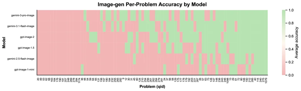
Figure 8 : Average accuracy for each model on each task, on image-generation problems.

This figure (Figure 8) is from the paper "Blind-Spots-Bench: Evaluating Blind Spots in Multimodal Models" and it illustrates the average accuracy of different models on various image-generation problems. Let's break down this figure in detail:

First, the core purpose of this graph is to evaluate the performance of various models on specific image-generation tasks. The title, "Image-gen Per-Problem Accuracy by Model," clearly indicates this.

Components of the Figure:

  1. Y-axis (Vertical Axis) - Model:

    • This axis lists the different models being evaluated. From top to bottom, they are:
      • gemini-3-pro-image
      • gemini-3.1-flash-image
      • gpt-image-2
      • gpt-image-1.5
      • gemini-2.5-flash-image
      • gpt-image-1-mini
    • These models represent different types or versions of multimodal models, particularly those focused on image generation.
  2. X-axis (Horizontal Axis) - Problem (qid):

    • This axis represents the individual problems in the image-generation tasks. Each position corresponds to a specific problem, identified by a "qid" (problem ID). Due to the large number of problems, the specific content of the problems is simplified into a series of labels.
  3. Color Coding - Average Accuracy:

    • Each cell in the graph (formed by the intersection of a model and a problem) is color-coded to represent the average accuracy of that model on the corresponding problem.
    • The color bar on the right explains the color meaning:
      • Colors leaning towards green (close to 1.0) indicate higher accuracy.
      • Colors leaning towards red (close to 0.0) indicate lower accuracy.
    • This visualization allows us to quickly identify which models perform well or poorly on which problems.

Flow and Interpretation of Data/Information:

  • The figure compares the performance of different models on the same problem by examining the color intensity at their intersection, and it also shows how a single model performs across different problems by observing the color variation along its row.
  • For example, we can see that the gemini-3-pro-image model (the topmost model) is predominantly green across most problems, indicating it generally has high accuracy on these image-generation tasks. In contrast, the gpt-image-1-mini model (the bottommost model) shows more red or orange in many problems, indicating lower accuracy.
  • Similarly, we can identify certain problems (i.e., certain positions on the X-axis) that appear dark red for all models, suggesting these problems are challenging for all evaluated models.
  • Conversely, some problems might be green for most models, indicating they are relatively easy to solve.

Method and Result Connection (Based on Paper Abstract):

  • This figure is part of the "blind-spots-bench" benchmark introduced in the paper. This benchmark aims to uncover model "blind spots" by designing tasks that seem simple to humans but are challenging for modern AI models.
  • The paper mentions they collected questions from AI course students, cleaned and annotated them, and developed an automated grading pipeline to evaluate various models.
  • This figure is one of the outputs of that automated grading pipeline, quantifying the accuracy of each model on each image-generation problem.

Conclusion (Information Derived from the Figure):

  • Significant Model Performance Differences: The performance of different models on the same problem varies significantly. Some models (like gemini-3-pro-image) perform well on most problems, while others (like gpt-image-1-mini) perform poorly.
  • Task Difficulty Distribution: Some problems are difficult for all models (large red areas), while others are relatively easy (large green areas). This suggests that "blind-spots-bench" indeed contains tasks that are challenging for current models.
  • No Single "Best" Model: The figure does not show any single model consistently performing best on all problems. This indicates that different models may excel at different types of tasks or have varying abilities in handling different types of "blind spots."
  • Supports Paper Findings: This figure supports the paper's findings that closed-source state-of-the-art models may perform well on existing benchmarks but show significant performance gaps (e.g., around 10% as mentioned in the abstract) compared to open-source models on benchmarks that expose specific "blind spots." While this figure itself doesn't directly compare open and closed models' overall gap, it shows the performance distribution of different models on a specific set of tasks, which aligns with the paper's discoveries.

In summary, this figure, through a color-coded matrix of average accuracies, clearly demonstrates the performance of various image-generation models on a series of specific tasks. It helps us understand the strengths and weaknesses of the models, as well as the difficulty distribution of the tasks in the benchmark. It is a powerful tool for assessing model performance on non-traditional tasks that humans consider simple.

← → flip · ↑ ↓ scroll notes · Esc exit