🌊 Tide

Information moves like the tide. We pick the waves worth studying.

中文

← Today's tide

Published 2026-07-05 · Microsoft · Qihao Zhao, Yangyu Huang, Yalun Dai et al.

ResearchStudio-Idea: An Evidence-Grounded Research-Ideation Skill Suite from ML Conference Outcomes

arXiv · HuggingFace · ▲53

Abstract (verbatim)

Large language models have made research ideation increasingly accessible, yet effective idea development requires more than generating candidate directions. Researchers must ground a problem in current literature, identify meaningful bottlenecks, differentiate from existing solutions, and evaluate risks before committing to implementation. We present ResearchStudio-Idea as a reusable skill suite for this first mile of research ideation. The suite includes Paper-Search, a standalone multi-source literature search skill; Scoop-Check, a standalone prior-art collision checker for novelty claims; and IdeaSpark, the end-to-end skill that composes evidence grounding, pattern-guided generation, collision retrieval, audit, and idea-card rendering into one workflow. IdeaSpark is constructed from a corpus of 1,947 machine learning conference papers collected from ICLR, ICML, and NeurIPS between 2021 and 2025, including Oral papers, a separately tracked high-citation subset, and rejected submissions. Analysis of these outcomes reveals 31 recurring ideation sub-patterns, consolidated into 15 reusable ideation patterns. Each pattern is operationalized as a structured card containing research contexts, bottleneck types, differentiation strategies, supporting precedents, and common failure modes. Given a research problem and an evidence bundle, IdeaSpark evaluates evidence readiness, reconstructs the surrounding research context, identifies unresolved bottlenecks, selects relevant patterns, instantiates one candidate direction, retrieves potentially conflicting prior work, and performs outcome-informed auditing. This workflow transforms reusable ideation patterns into traceable research proposals. Blind automated-judge evaluations show that IdeaSpark consistently produces stronger research proposals than no-skill and generic-skill baselines while maintaining competitive novelty.

Background

Background Analysis

1. Technical Context
With the advancement of large language models (LLMs), researchers increasingly rely on automated tools for research ideation, such as literature search, hypothesis generation, and experiment planning. However, a critical gap exists between "generating initial ideas" and "developing actionable research directions." Researchers need to ground problems in existing literature, identify core bottlenecks, differentiate from prior work, and assess risks. For example, an idea like "improving ML model efficiency" must address questions like, "What unresolved flaws exist in current methods?" or "How does my approach avoid duplicating existing research?" This need is particularly acute in AI, where rapid iteration and high competition demand efficient screening of valuable directions.

2. Previous Limitations
Existing tools suffer from:
- Fragmentation: Functions like literature search, novelty checking, and candidate generation are scattered across disjointed tools, lacking a unified workflow.
- Shallow Analysis: Many systems generate superficially novel ideas but fail to verify feasibility or distinguish "surface-level innovation" from "substantial contribution." For instance, studies show LLM-generated ideas may appear more novel than experts' but are harder to implement.
- Lack of Empirical Guidance: Current methods rely heavily on rules or generic models, rarely leveraging empirical data from conference papers (e.g., failure cases, reviewer feedback) to avoid common pitfalls.

3. Proposed Solution
ResearchStudio-Idea addresses these issues through three core skills:
- Paper-Search: Integrates multi-platform literature retrieval for reusable evidence.
- Scoop-Check: Verifies novelty claims against existing work.
- IdeaSpark: Combines these into an end-to-end workflow. Its key innovation is "ideation pattern cards"—structured strategies extracted from 1,947 ML conference papers (including accepted, high-citation, and rejected submissions). These cards document successful patterns, bottleneck types, differentiation strategies, and failure modes, guiding LLMs to generate validated research directions.

4. Key Differentiators
Unlike prior work, this approach:
- Empirical Foundation: Leverages real-world conference outcomes (successes and failures) rather than only accepted papers or generic corpora.
- Auditability: Generated ideas include explicit evidence chains and failure mode analyses for verification.
- Composability: Supports combining multiple patterns, reflecting the complexity of real research.

By transforming the "literature-to-idea" process into actionable skills, ResearchStudio-Idea moves beyond black-box generation toward transparent, evidence-grounded research ideation.
Method, Figure by Figure

M E T H O D1 / 5

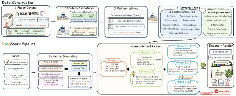
Figure 2 : IdeaSpark data-to-skill workflow. The upper band constructs reusable ideation assets from the 1,947-paper ICLR / ICML / NeurIPS corpus: papers are outcome-labeled, normalized into strategy signatures, mined into 31 sub-patterns, and induced into 15 operational pattern cards. The lower band shows how the skill uses those cards at inference time: evidence grounding and full-text retrieval feed a staged reasoning loop for bottleneck diagnosis, pattern-guided candidate generation, and collision/audit verdicts, followed by expansion, validation, and idea-card deliverables.

This diagram illustrates IdeaSpark's "Data to Skill" workflow, divided into the upper section "Data Construction" and the lower section "IdeaSpark Pipeline (Inference-time Workflow)", clearly presenting the complete logic from literature data to research idea generation:

1. Upper Section: Data Construction (From Literature to Reusable Creative Assets)

The core of this part is extracting reusable creative patterns from 1,947 machine learning conference papers (ICLR, ICML, NeurIPS 2021-2025). The process proceeds in arrow order as follows:

  1. Paper Corpus (Paper Repository):
    The input consists of 1,947 papers from ICLR, ICML, and NeurIPS (2021-2025), including Oral papers, highly cited subsets, and rejected submissions. This step serves as the "raw material" for data, providing the foundational literature for research context.

  2. Strategy Signatures (Strategy Signatures):
    This involves "result annotation" (e.g., success/failure, method type, etc.) and "standardization" (converting a paper's methods, problems, etc., into a unified "strategy signature" format). This step structurally analyzes the literature to extract key strategy information, preparing for subsequent pattern mining.

  3. Pattern Mining (Pattern Mining):
    Based on strategy signatures, methods such as text embedding (e.g., Large Language Model), LDA topic modeling, and clustering (Clusters) are used to mine 31 "sub-patterns (sub-patterns)" from the literature. This step identifies recurring research ideas or problem-solving patterns from a large volume of literature.

  4. Pattern Cards (Pattern Cards):
    The 31 sub-patterns are integrated into 15 "operational pattern cards (operational pattern cards)". Each pattern card includes:

  5. Definition, Operational Signature, Success Conditions, Failure Conditions;
  6. Technical Trend, Differentiation, Tactical Failure Mode, etc.
    These cards are "reusable creative assets," providing structured pattern guidance for subsequent reasoning.

2. Lower Section: IdeaSpark Pipeline (Creative Generation Workflow at Inference Time)

This part shows how IdeaSpark uses the above pattern cards to generate ideas given a research problem and evidence package. The process proceeds in arrow order as follows:

  1. Input (Input):
    The input includes Research Problem, Candidate Directions, Timeline Budget, Constraints. This is the "starting point" for idea generation, clarifying the user's needs and limitations.

  2. Evidence Grounding (Evidence Anchoring):
    This involves "scope definition" (e.g., 0-6 months, 6-12 months research scope) and "full-text retrieval" (obtaining relevant literature from the repository), generating a "Literature Table (Literature Table)" (including 50+ related papers, full-text cache, etc.). This step provides an "evidence base" for subsequent analysis, ensuring that ideas are based on existing literature.

  3. Staged Reasoning Loop (Staged Reasoning Loop):
    This is the core reasoning phase, divided into multiple stages:

  4. Phase 1 (Phase 1):
    • Find Gap (Identify Gaps): Identify "unresolved bottlenecks" in existing research;
    • One/two Hop (1/2 Hop): Expand 1-2 layers of related research from relevant literature;
    • Closest Adjacent Papers (Most Similar Papers): Find the papers most relevant to the problem.
  5. Phase 2 (Phase 2):
    • Pattern Fit (Pattern Matching): Match the problem with 15 pattern cards to filter relevant patterns;
    • Instantiate Candidate (Instantiate Candidate): Generate initial creative candidates based on matched patterns (e.g., "Write 3-5 candidates").
  6. Phase 2.1 & 2.2 (Sub-phases):
    • Phase 2.1 (Pattern Fitting and Search): Further optimize pattern matching, conducting "pattern fitting" and "symbolic/semantic search";
    • Phase 2.2 (Instantiation and Validation): "Instantiate" (e.g., "Instantiate 3-5 candidates") and "validate" (e.g., "Verify 3-5 candidates") the creative candidates.
  7. Phase 3 (Phase 3):

    • Phase 3.1 (Collision Retrieval): Check the "novelty" of the idea to avoid "collisions" with existing research (e.g., "Collision Retrieval," "Significance-specific Search");
    • Phase 3.2 (Audit): "Audit" the idea (e.g., "Audit via: ...," "Anti-patterns") to identify potential risks;
    • Phase 3.3 (Patch and Adjust): Adjust the idea based on audit results (e.g., "Patch Changed Fields," "Merge with Other Candidates").
  8. Expand + Render (Expand and Render):
    For ideas that pass the audit, perform "expansion" (e.g., "Fabrication Plan," "Implementation Check") and "rendering" (generate the final "Idea Card (Idea Card)"), including information such as Methods, Tech, Valid.

Core Logic of the Methodology

IdeaSpark's workflow is "data-driven + reasoning loop":
- First, extract reusable "pattern cards" from a large amount of literature (data construction phase) to provide structured guidance for creativity;
- Then, during inference, obtain background knowledge through "evidence anchoring" and generate and optimize ideas through a "staged reasoning loop" (identify gaps → match patterns → instantiate → validate → adjust), ultimately outputting actionable idea cards.

This method ensures that ideas are not only based on existing literature but also identify research bottlenecks, differentiate from existing solutions, and assess risks, solving the problem of "only generating candidate directions without in-depth validation."

(Note: The arrows in the diagram indicate the direction of data/information flow, with the output of each module serving as the input to the next module, forming an end-to-end process from "literature data" to "creative output.")

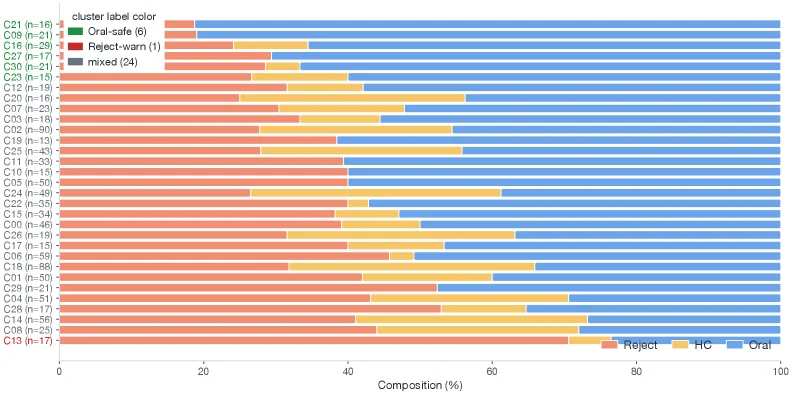
Figure 3 : Acceptance composition of the 31 clusters, sorted by Oral rate among O + R O{+}R . Six clusters clear the 65% Oral threshold; one clears the 65% Reject threshold. The remaining 24 are mixed. Cluster labels are colored by risk flag (green = Oral-safe, red = Reject-warn, gray = mixed; deliberately off the bar palette); the threshold uses p O p_{O} among O + R O{+}R , so it is shown via label color rather than an x x -axis line, because the bars are O / H ​ C / R O/HC/R shares that include HC.

This figure (Figure 3) displays the "acceptance composition" for 31 clusters, which are sorted based on the "proportion of Oral rate in the sum of Oral (O) and Reject (R) (O+R)."

First, let's examine the structure of the figure: * Y-axis: Lists the 31 clusters, each with a label (e.g., C21, C19) and the number of samples in that cluster (e.g., C21 (n=16) indicates that cluster C21 has 16 papers). These cluster labels are assigned different colors, representing different "risk flags": * Green: Indicates "Oral-safe," meaning that papers in this cluster have a high probability of being accepted as oral presentations. * Red: Indicates "Reject-warn," meaning that papers in this cluster have a high probability of being rejected. * Gray: Indicates "mixed," meaning that the distribution of papers in this cluster between acceptance and rejection is relatively even, or there is no clear tendency. * X-axis: Represents "Composition (%)," ranging from 0% to 100%. Each cluster corresponds to a horizontal bar graph, which is divided into three colored sections, representing: * Orange: The proportion of papers that were "Rejected." * Yellow: The proportion of papers that fall into the "HC" category (possibly referring to High-Citation, or another specific category, but according to the caption, it, along with O and R, constitutes the total). * Blue: The proportion of papers that were accepted as "Oral" presentations. These three sections add up to 100%, indicating the distribution of final outcomes for all papers in that cluster.

The flow of data and the order of information interpretation are as follows: 1. First, we focus on each cluster on the Y-axis. Each cluster has a name (e.g., C21) and a sample size (e.g., n=16). 2. Then, we observe the corresponding horizontal bar graph for that cluster. The length of the bar represents the total number of papers in the cluster (expressed as a percentage, but in reality, the total length of each bar is 100%, representing the entire sample of the cluster). 3. The color distribution (orange, yellow, blue) of the bar graph shows the proportion of papers in the cluster classified as "Rejected," "HC," and "Oral." 4. The color of the cluster label (green, red, or gray) provides a high-level "risk flag" or classification, based on whether the "Oral rate in O+R" exceeds a certain threshold (specifically 65%): * If the "Oral" (blue) portion of a cluster is very high, and its "Oral rate" (i.e., the blue portion as a proportion of the orange+blue portion) exceeds 65%, then its label will be green ("Oral-safe"). * If the "Reject" (orange) portion of a cluster is very high, and its "Reject rate" (i.e., the orange portion as a proportion of the orange+blue portion) exceeds 65%, then its label will be red ("Reject-warn"). * For other cases (i.e., neither the "Oral rate" nor the "Reject rate" exceeds 65%), the cluster's label will be gray ("mixed").

The method revealed by this figure works as follows: * Cluster Analysis: Papers are first divided into 31 different clusters. These clusters may be based on paper topics, methods, results, or other features. * Outcome Classification: For each paper in each cluster, it is classified based on its final outcome (whether it was accepted as an oral presentation, rejected, or falls into another category like HC). * Proportion Calculation: The proportion of papers in each cluster that fall into different outcome categories is calculated. * Threshold Setting and Marking: A threshold (here, 65% "Oral rate" in O+R) is set, and based on this threshold, the overall trend of each cluster is judged. If a cluster's "Oral rate" exceeds 65%, it is marked as "Oral-safe"; if the "Reject rate" exceeds 65%, it is marked as "Reject-warn"; otherwise, it is marked as "mixed." * Visualization: The proportions of different outcome categories in each cluster are intuitively displayed through horizontal bar graphs, and the overall risk or trend of the cluster is highlighted through the color of the label.

Conclusion: * The figure shows the acceptance composition for 31 clusters. * Among them, 6 clusters passed the "65% Oral rate" threshold (i.e., their "Oral" (blue) portion accounts for more than 65% in "Oral+Reject" (O+R)), and the labels for these clusters are green ("Oral-safe"). * 1 cluster passed the "65% Reject rate" threshold (i.e., its "Reject" (orange) portion accounts for more than 65% in "Oral+Reject" (O+R)), and the label for this cluster is red ("Reject-warn"). * The remaining 24 clusters are marked as "mixed," with gray labels, meaning their distribution between "Oral" and "Reject" did not reach either of the above thresholds. * The colors in the bar graph (orange, yellow, blue) represent the proportions of "Rejected," "HC," and "Oral" papers, respectively. It should be noted that the "HC" category is not explained in detail in the caption, but it, along with "Oral" and "Reject," constitutes the complete distribution of paper outcomes. * The clusters are sorted by the "proportion of Oral rate in O+R," which means that the clusters in the figure, from top to bottom, may have gradually decreasing "Oral rates," or are sorted according to some metric related to "Oral."

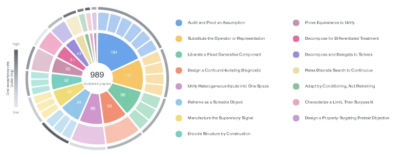
Figure 5 : Ideation-pattern hierarchy across 989 clustered papers. Three concentric rings share one angular layout, ordered by size clockwise from 12 o’clock; categorical colors identify the 15 patterns and are reused across all rings, with white gaps separating segments. Inner ring : the 15 induced Level-1 ideation patterns, each wedge sized by its clustered-paper count (the count is printed inside the larger wedges; full pattern names are in the right-hand legend). Middle ring : each pattern’s arc is subdivided into its constituent sub-clusters (31 in total), shaded as a lighter tint of the parent pattern; the number of segments within a wedge shows how finely that pattern fragments, while the segment angle is the equal share within the pattern, not the per-sub-cluster paper count. Outer ring : a thin heat band encoding each pattern’s Oral acceptance rate p O = n O / ( n O + n H ​ C + n R ) p_{O}=n_{O}/(n_{O}+n_{HC}+n_{R}) on the light-to-dark gray scale shown at left (light = low, dark = high), so reviewer outcome can be read against methodology at a glance. Totals: 15 patterns, 31 sub-clusters, 989 clustered papers (of 1,891 embedded).

This figure (Figure 5) illustrates the "hierarchy of conceptual patterns" across 989 clustered papers, using a layout of three concentric rings (with consistent angular ordering, starting clockwise from the 12 o’clock position). Combined with color, size, segmentation, and heat bands, it visually presents the distribution, subcluster divisions, and review acceptance rates of 15 conceptual patterns. The analysis is broken down by ring below:

1. Inner Ring (Level-1 Conceptual Patterns)

  • Content: Displays 15 "induced Level-1 conceptual patterns," where the size of each wedge is determined by the number of clustered papers (large wedges are labeled with specific counts, e.g., 184, 117; full pattern names appear in the legend on the right).
  • Color and Correspondence: 15 categorical colors (e.g., blue for "Audit and Pivot an Assumption," orange for "Substitute the Operator or Representation") uniquely identify each pattern, with colors reused across all rings to facilitate cross-ring associations.
  • Purpose: Shows the highest-level conceptual patterns and their corresponding paper count scales, helping quickly identify which patterns are more prevalent in the clustered papers.

2. Middle Ring (Subcluster Divisions)

  • Content: Each Level-1 pattern’s wedge is subdivided into its constituent subclusters (31 subclusters total). The subcluster color is a "lighter shade" of the parent pattern (maintaining color linkage for easy attribution), while the number of segments in a wedge reflects the "granularity of subdivision" (i.e., how many subclusters exist); each subcluster’s angle represents its "proportional share within the pattern" (the proportion of papers not in subclusters).
  • Purpose: Reveals the internal structure of each Level-1 pattern, illustrating the logic of subdivision (e.g., some patterns may have more subclusters, indicating higher internal diversity).

3. Outer Ring (Review Acceptance Rate Heat Bands)

  • Content: A thin heat band encodes the Oral acceptance rate \( p_O = \frac{n_O}{n_O + n_{HC} + n_R} \) (where \( n_O \) = Oral acceptances, \( n_{HC} \) = high-citation candidates, \( n_R \) = rejections). The heat band’s color gradients from light gray (low acceptance rate) to dark gray (high acceptance rate) (the left color bar labels "low" to "high").
  • Purpose: Links "methodology (conceptual patterns)" to "review outcomes (acceptance rates)," allowing readers to quickly compare review performance across patterns (e.g., dark gray patterns may be more favorably received in reviews).

Data Flow and Overall Logic

The organizational logic of the data in the figure is: from macro (distribution of 15 Level-1 pattern counts) to meso (subcluster subdivisions of each pattern), then to micro (review acceptance rates of each pattern). Through the nested ring structure and visual encoding via color, size, and heat, it clearly conveys three layers of information:
- Which conceptual patterns are more common in clustered papers (size of the inner ring);
- How the internal structure of each pattern is organized (segments in the middle ring);
- Differences in review acceptance rates across patterns (heat in the outer ring).

Intuitive Illustration of Method Operation (With Paper Context)

The paper proposes the "ResearchStudio-Idea" skill suite for studying the "first mile" of ideation (from problem to initial conception). This figure is an analytical result of the suite: based on cluster analysis of 1,947 ML conference papers (ICLR, ICML, NeurIPS 2021–2025), it identifies 31 recurring conceptual subpatterns, merged into 15 reusable conceptual patterns. The figure uses a three-ring structure to display these patterns’ distribution (count), structure (subclusters), and effectiveness (acceptance rate), helping researchers understand: which patterns are more prevalent, how they are internally subdivided, and how they perform in reviews—providing data support for pattern selection and optimization in tools like "IdeaSpark" (e.g., high-acceptance-rate patterns may be prioritized).

Conclusion-Oriented Interpretation

This figure uses visual encoding with three concentric rings to clearly show the count distribution (inner ring), subcluster subdivisions (middle ring), and review acceptance rates (outer ring) of 15 conceptual patterns across 989 clustered papers. Readers can associate patterns with color, judge prevalence by size, understand structure via segments, and compare effectiveness through heat, enabling them to quickly grasp the characteristics and performance of different conceptual patterns. For example, the blue pattern ("Audit and Pivot an Assumption") has the most papers (184) and a high acceptance rate (dark gray); some low-count patterns (e.g., 51, 50) may have lower acceptance rates (light gray). This visualization helps researchers efficiently identify valuable, high-acceptance-rate conceptual patterns to support ideation optimization and selection.

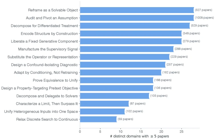
Figure 11 : Ideation-pattern breadth: number of distinct domains each ideation pattern has ≥ 5 \geq 5 papers in (out of 28). The annotation gives each pattern’s multi-label paper count: a paper is counted under every pattern it carries, so these counts overlap across patterns and sum to more than the 1 , 891 1{,}891 -paper corpus. Most patterns touch ≥ 18 \geq 18 domains, supporting the skill’s domain-agnostic positioning.

This figure (Figure 11) illustrates the “number of distinct domains each ideation pattern covers” (i.e., how many different research domains have at least 5 papers associated with a pattern), core to validating the method (ResearchStudio - Idea)’s domain - agnostic nature. Here’s a detailed breakdown:

Components and Information Flow

  • X - axis: Labeled “# distinct domains with ≥5 papers”, it represents “the number of distinct research domains where a pattern has at least 5 papers”. Values range from 0 to 25, showing the scale of domain coverage for each pattern.
  • Y - axis: Lists 15 ideation patterns (e.g., “Reframe as a Solvable Object”, “Audit and Pivot an Assumption”), extracted from 1,891 machine learning conference papers (ICLR, ICML, NeurIPS 2021–2025).
  • Blue bar graphs: The length of each bar corresponds to the “number of distinct domains with ≥5 papers” for that pattern. For example, the bar for “Audit and Pivot an Assumption” is the longest, with “(1008 papers)” in parentheses? No—clarify: The number in parentheses is the total number of papers for the pattern (since the caption notes “a paper is counted under every pattern it carries, so these counts overlap”, meaning a paper can belong to multiple patterns, so total paper counts (1,891) are overlapping sums). The x - axis value represents the “number of domains”, e.g., the bar for “Reframe as a Solvable Object” extends to ~25 on the x - axis (the maximum x - axis value).

How the Method Works (From the Figure)

ResearchStudio - Idea aims to provide domain - agnostic ideation support (i.e., the method is not tied to specific research domains and works across domains). This figure validates this by analyzing the “domain coverage” of 15 ideation patterns: 1. Pattern Extraction: From 1,891 papers, 31 recurring ideation sub - patterns are analyzed and consolidated into 15 reusable patterns. 2. Domain Coverage Statistics: For each pattern, we count “how many distinct research domains have at least 5 papers associated with the pattern” (the x - axis metric: “# distinct domains with ≥5 papers”). 3. Interpretation of Results: The figure shows that most patterns cover ≥18 domains (from the x - axis, most bars are close to or exceed 15, even reaching 25). For example: - “Audit and Pivot an Assumption” has the longest bar, covering ~25 domains (the maximum x - axis value), with a total of 1008 papers (in parentheses). - “Reframe as a Solvable Object” covers ~25 domains, with 827 papers (in parentheses). - Even patterns with less coverage (e.g., “Relax Discrete Search to Continuous”) cover ~10 domains (around x - axis value 10), with 59 papers.

Conclusion (Method Effectiveness from the Figure)

This figure supports ResearchStudio - Idea’s “domain - agnostic positioning”: - Most ideation patterns cover ≥18 different research domains (from the x - axis, most bars are above 15, even near 25). - This means that regardless of the research problem’s domain, ResearchStudio - Idea’s ideation patterns have broad applicability, as they are validated across multiple domains (via ≥5 papers per domain). - The paper notes “sum to more than the 1,891 - paper corpus” because a paper can belong to multiple patterns (i.e., a single paper may be classified under multiple ideation patterns, so the sum of total papers across patterns exceeds the actual number of papers). This also means patterns overlap, but each pattern’s domain coverage still reflects its cross - domain applicability.

In short, this figure validates that ResearchStudio - Idea’s method (ideation patterns) is domain - agnostic—it can effectively support research ideation across multiple research domains.

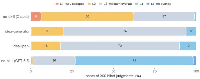
Figure 16 : Distribution of novelty levels per system (L1 = fully scooped → \rightarrow L5 = no overlap). The skill generators concentrate at L3 (medium overlap: shared framing/domain, distinct mechanism); the bare GPT-5.5 baseline piles up at L4, where its vagueness evades collision.

This figure (Figure 16) illustrates the distribution of novelty levels across different systems. The horizontal axis represents the percentage of 300 blind judgments, while the vertical axis lists four different systems: no-skill (Claude), idea-generator, IdeaSpark, and no-skill (GPT-5.5). Each system is represented by a horizontal bar graph, which is segmented into different colored blocks corresponding to various novelty levels.

The legend explains the color coding for the novelty levels: - Red (L1): Fully scooped, indicating that the idea highly overlaps with existing research. - Orange (L2): Not explicitly defined but likely represents a lower degree of overlap. - Yellow (L3): Medium overlap, meaning the idea shares a framework or domain but has a distinct mechanism. - Light blue (L4): No overlap, but potentially vague to avoid collision. - Dark blue (L5): No overlap, possibly representing a completely novel idea.

From the figure, we can observe: - The no-skill (Claude) system's ideas are primarily distributed in L2 (56%) and L3 (37%), suggesting that some of its ideas overlap with existing research, while others have moderate novelty. - The idea-generator system's ideas are mainly concentrated in L3 (74%), indicating that most of its generated ideas have moderate novelty, sharing a framework but with distinct mechanisms. - The IdeaSpark system's idea distribution is similar to that of the idea-generator, with a focus on L3 (72%), suggesting that its generated ideas also have moderate novelty. - The no-skill (GPT-5.5) system's ideas are predominantly in L4 (71%), indicating that most of its generated ideas are vague and avoid conflict, with lower novelty.

This figure reveals the performance of different systems in terms of research idea novelty. IdeaSpark, as an end-to-end skill suite, can generate ideas with moderate novelty, while the GPT-5.5 baseline primarily produces vague and less novel ideas. This suggests that IdeaSpark has an advantage in research idea generation, better balancing novelty and practicality.

← → flip · ↑ ↓ scroll notes · Esc exit